Tyrone GAA
Digital, Environment, Events, Exhibition, Identity, Marketing, Strategy
An introduction to sports branding that started over 25 years ago and is still going strong today.
The Client
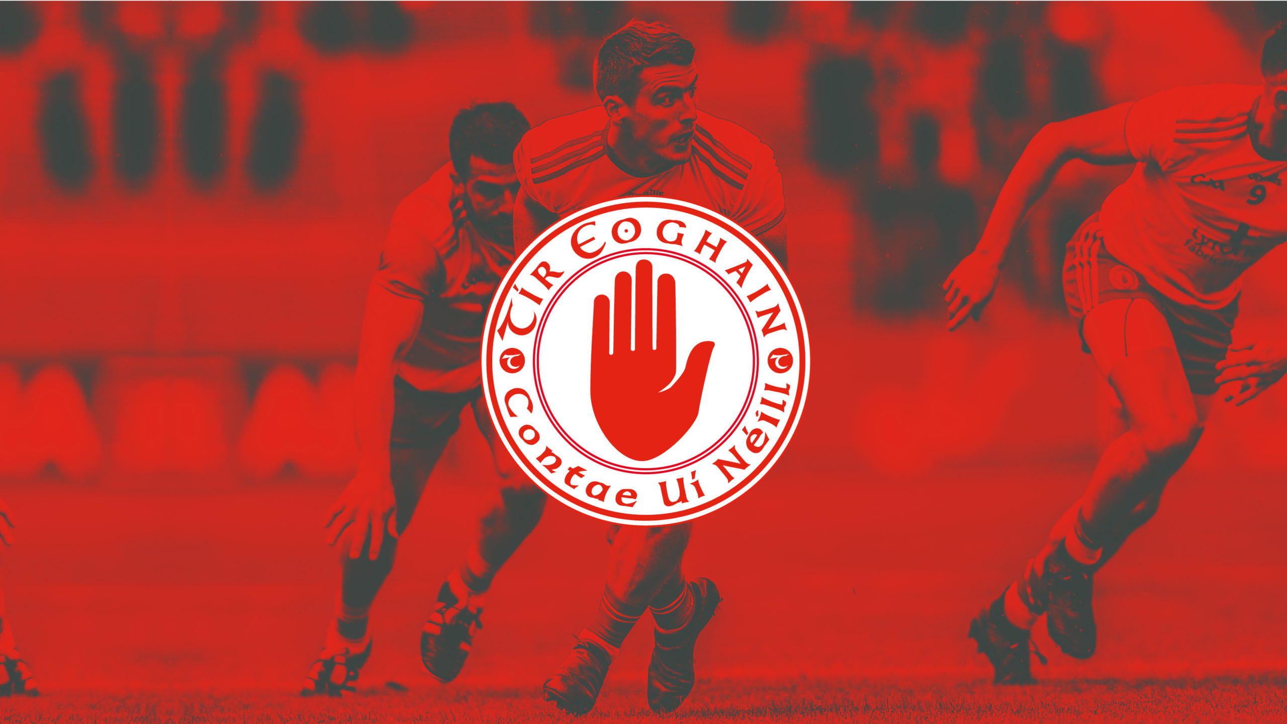
Tyrone GAA is part of the Gaelic Athletic Association. It’s one of the 32 counties the GAA takes responsibility for in terms of the administration and promotion of Gaelic games and culture. There are 52 clubs within Tyrone county taking part in football, hurling, handball, camogie and a range of cultural activities including Scór and Irish language classes.
The Challenge
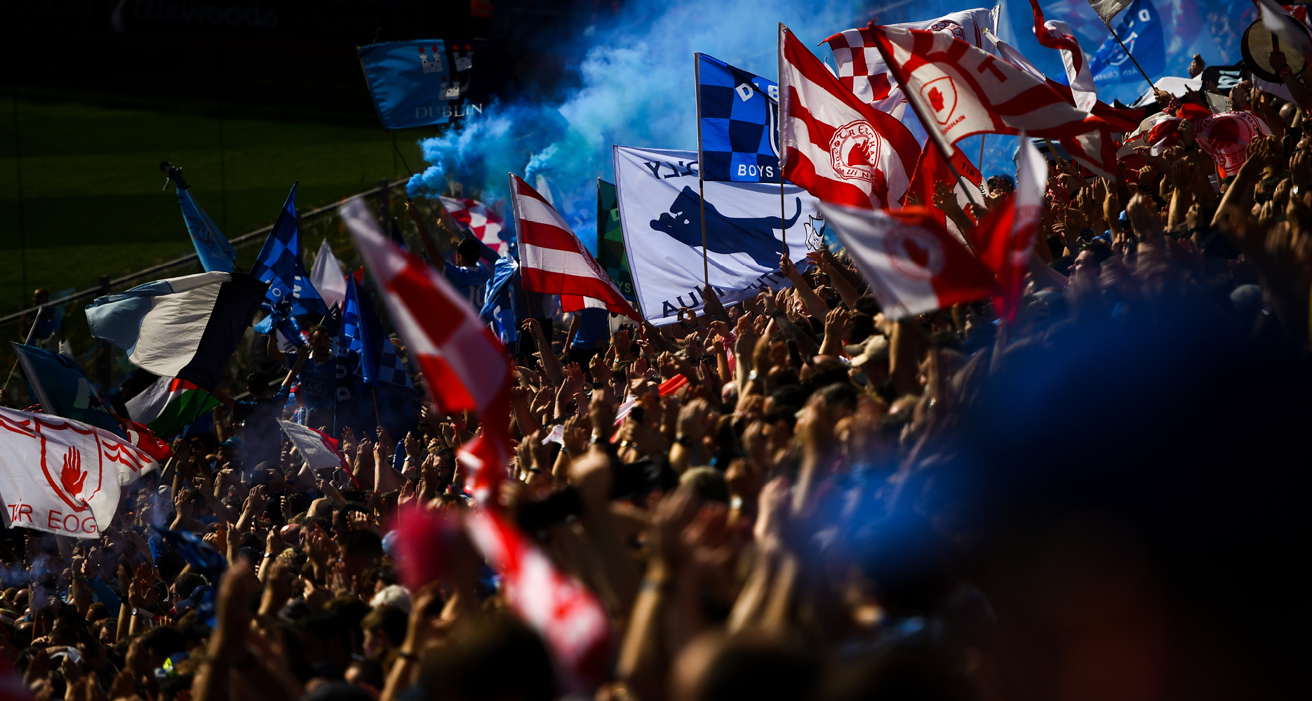
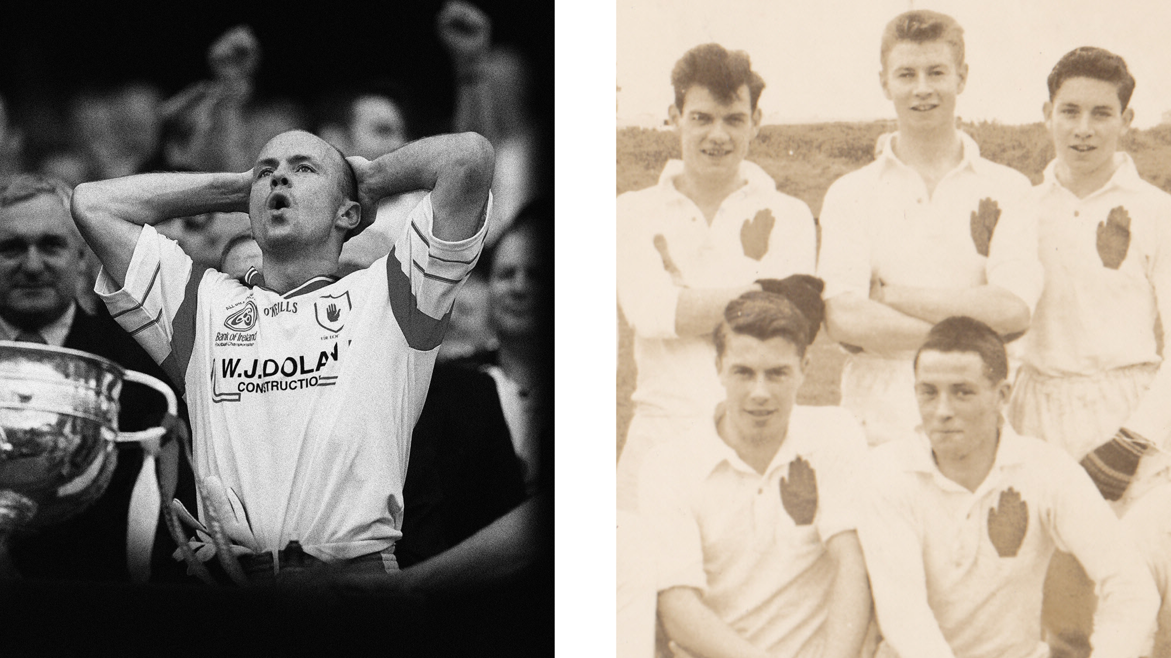
For as long as any of us can remember, Tyrone, The O’Neill County or the Red Hands, have proudly displayed the Red Hand on their jersey, either on its own or within a shield. Text, when present, sat outside the shield. Our challenge in 2005 was to modernise the crest but maintain the heritage that was built up over many decades. But our real challenge started even earlier than that!
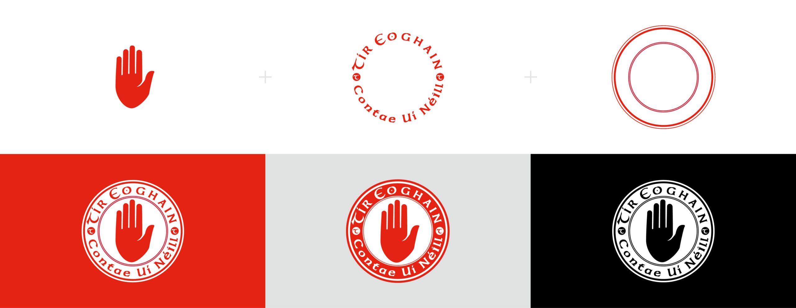
For the princely sum of £10 we created the current GAA crest. Money had to change hands (excuse the pun) so that Tyrone GAA owned the crest that is now a registered trademark. Our main goal in creating the design was simplicity. We wanted a locked up shape, one colour, a strong hand and to make sure the Tyrone name and O’Neill heritage were contained within the overall lock up.
Thinking ahead and knowing how widely the crest would be used, we felt the circle offered a great story and flexibility.
Being in a circle allows us experience each other as equals. Each person is the same distance apart from the next participant, and no one is seated higher than or stands apart from others in a circle.

However our first real introduction to Tyrone GAA was before the crest and came when we got involved with a subcommittee in Tyrone GAA called the PR & Marketing Committee. The front facing name of the group was Club Tyrone and they were to become one of the most successful fundraising groups in Ireland.

The Result
Wouldn’t it be fantastic to say that after we produced a new identity for the county, they went on to win three All-Irelands! Unfortunately not the case, however from the mid 90s onwards Tyrone did embark on what could be described as a mini revolution.
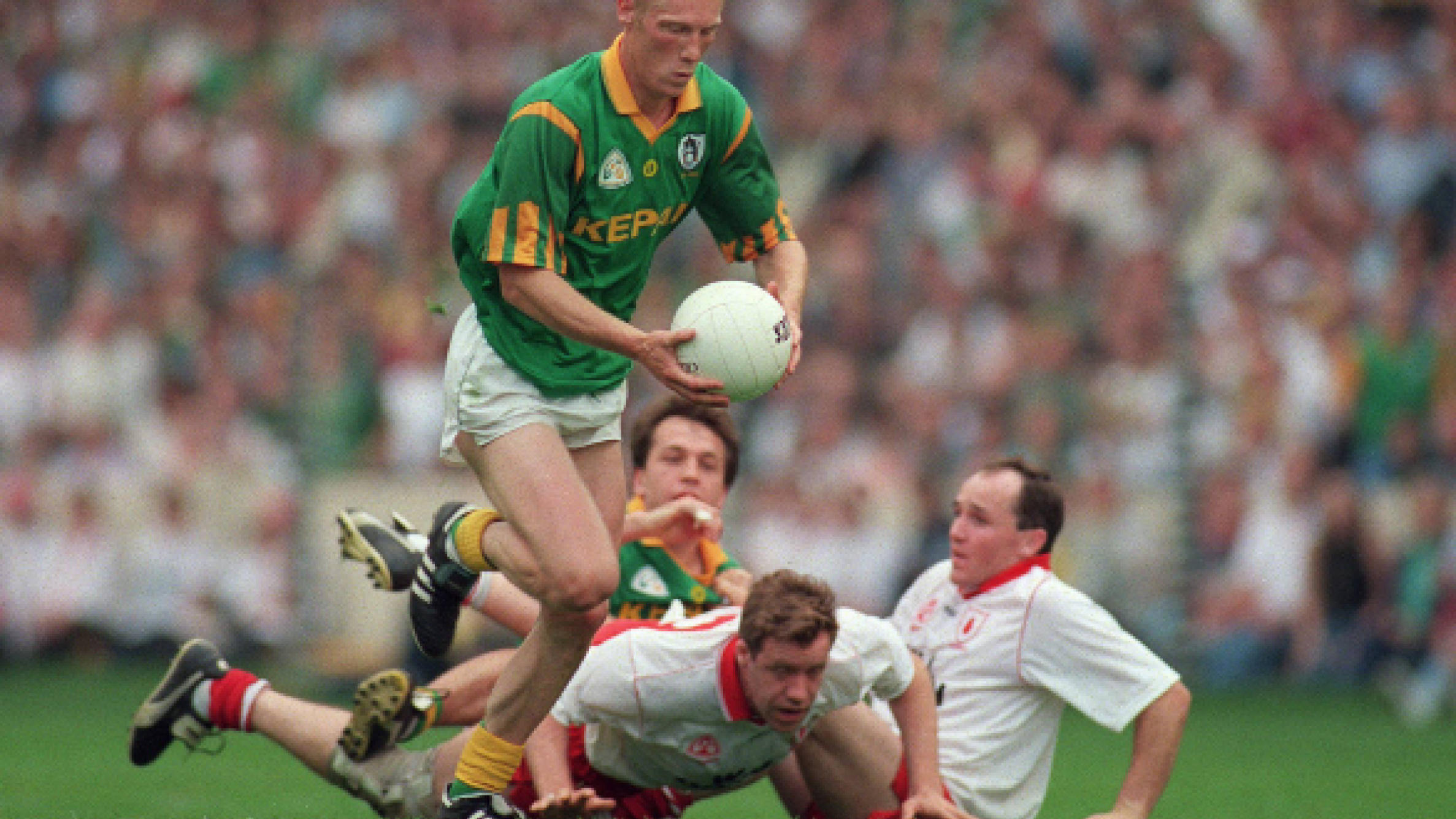
In 1996, a demoralising defeat to Meath in an All-Ireland semi-final seemed to light a touch paper across the county in so many ways. Read more on the Tyrone brand story.
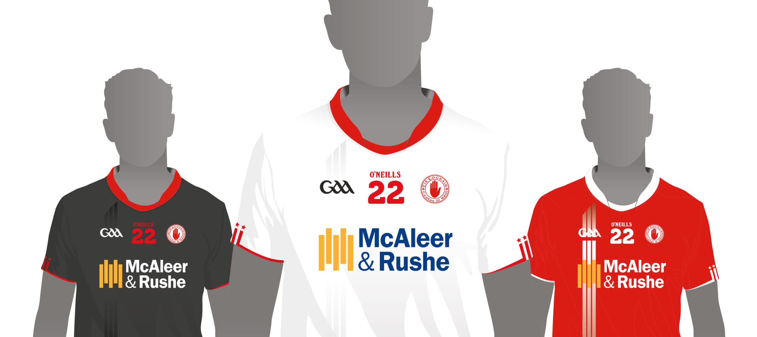
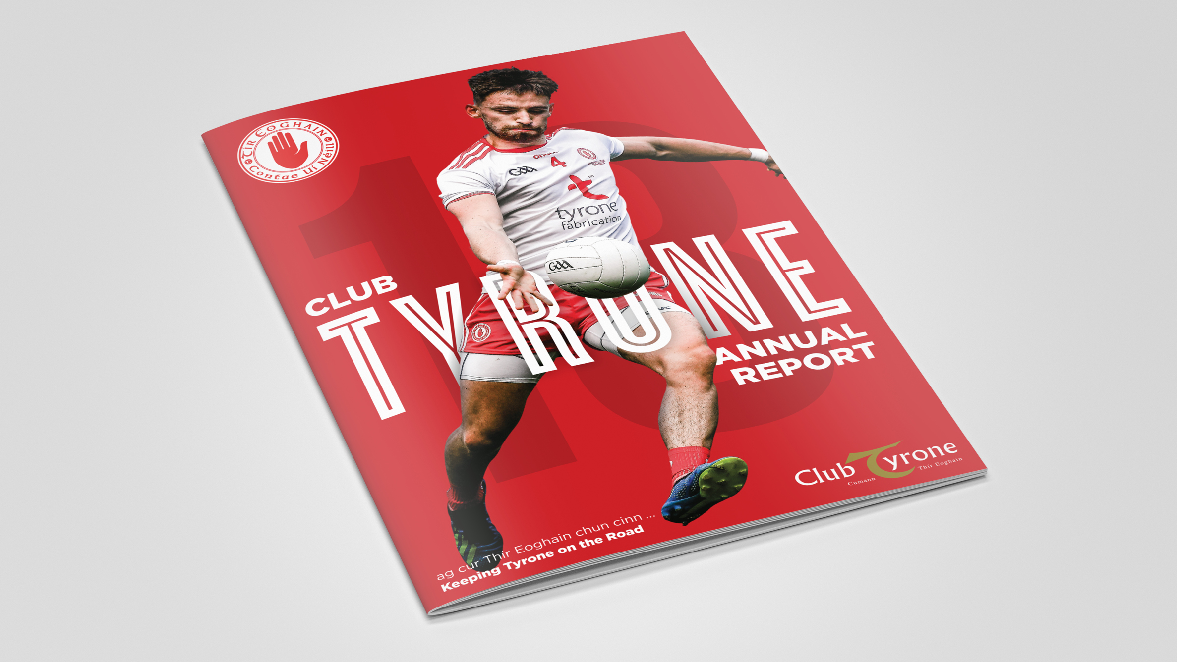
On a couple of occasions we’ve had the privilege of creating the Tyrone jersey, once when our client McAleer & Rushe was the main sponsor. We created a nice feature where the sponsor logo was integrated into the design, instead of just looking like an add on.
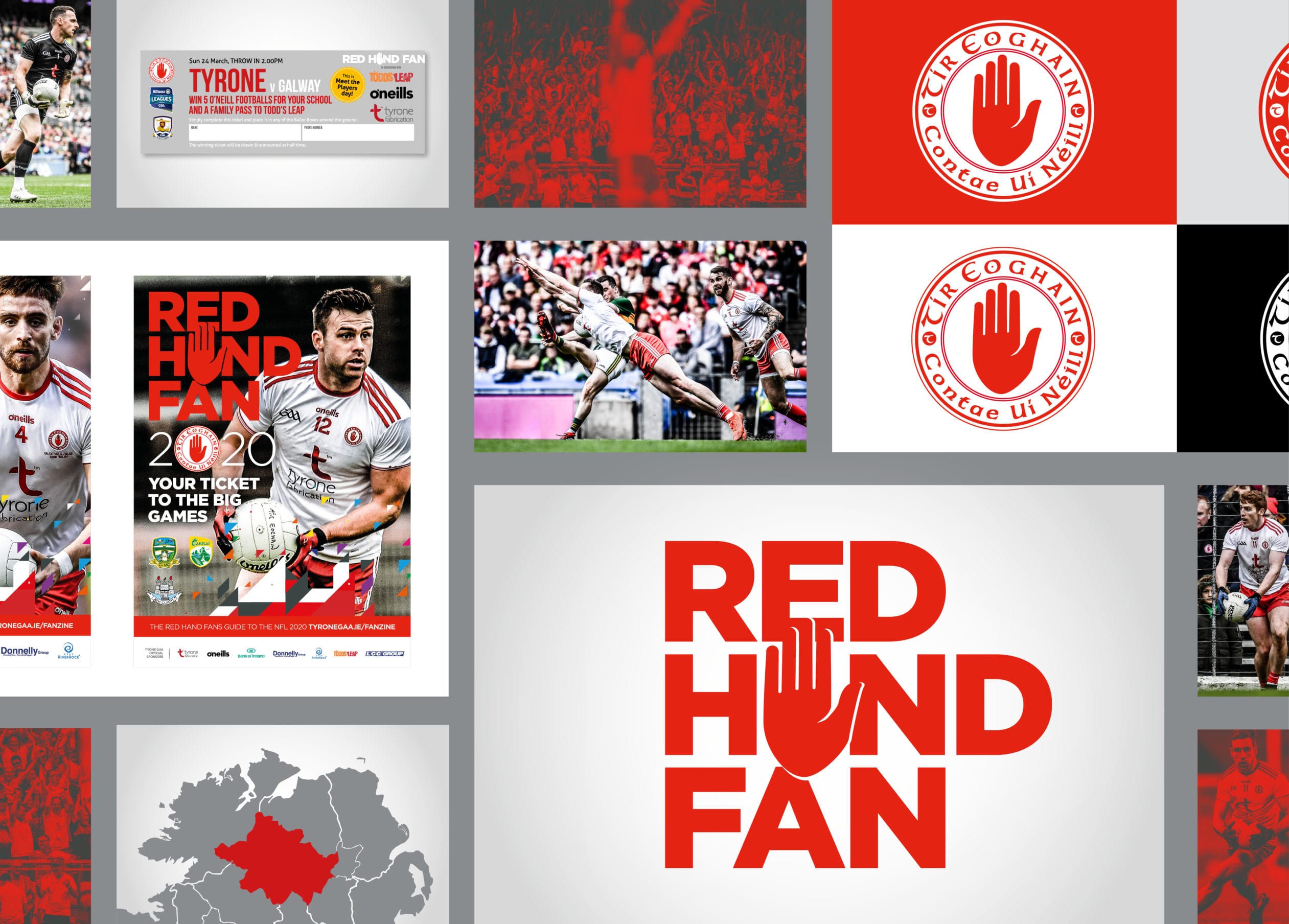
The red hand shape has become a great styling device. It can easily be dropped into text and brand elements to create an immediate sub identity.
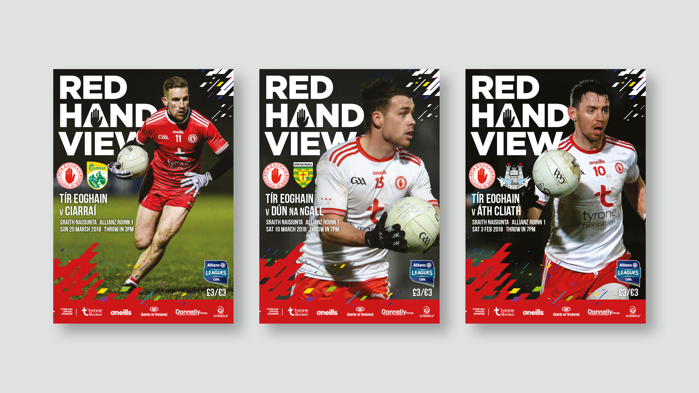
We’ve been thrilled to play our part over these decades across so many areas. The loyalty and commitment from everyone involved has helped us maintain a level of consistency for the Tyrone brand across print and digital assets, and the County would be regarded as one of the leaders not only on the field, but off it as well.

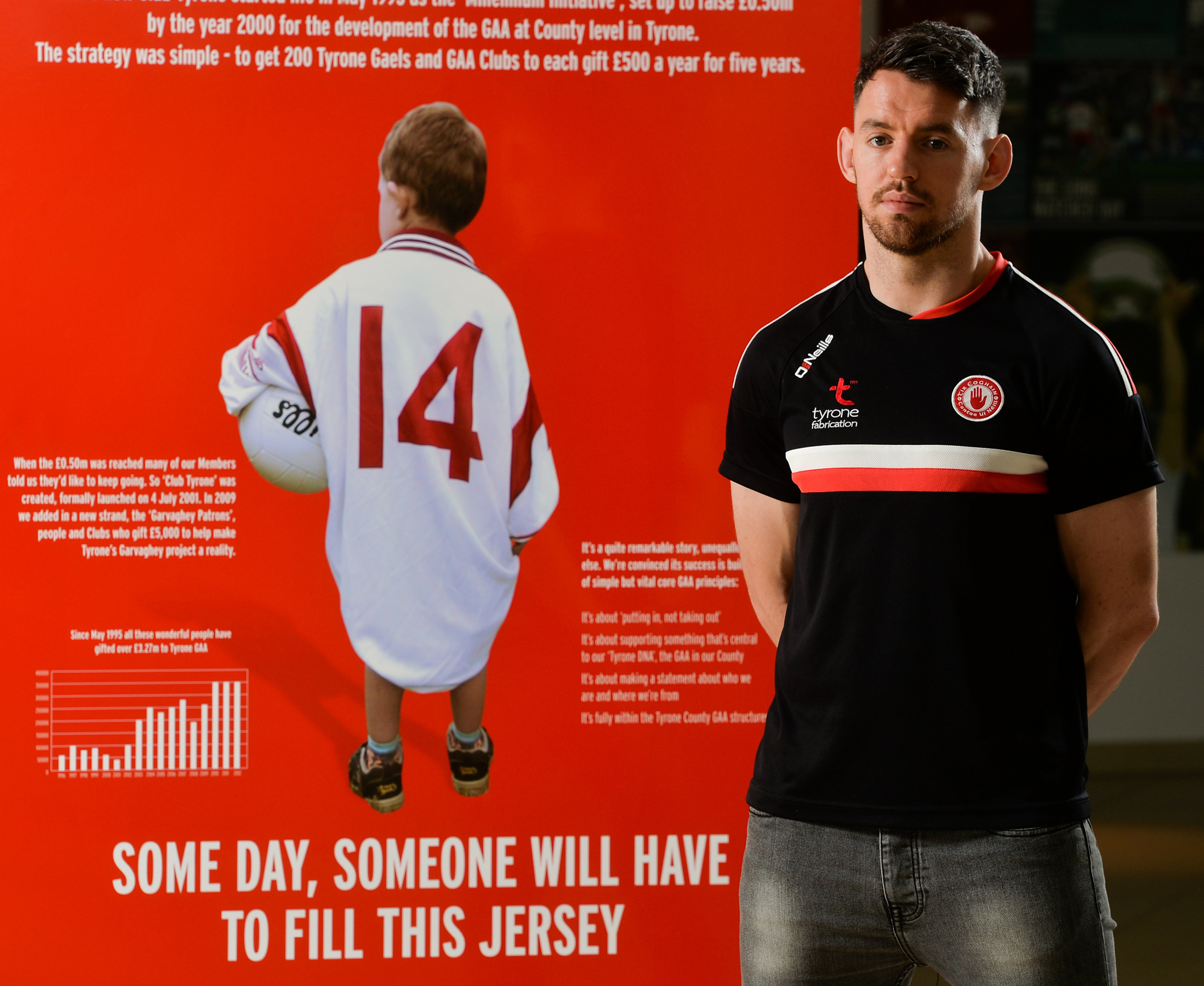
Since 1996, Club Tyrone has raised £5.6 million for the development of Gaelic games in the county.
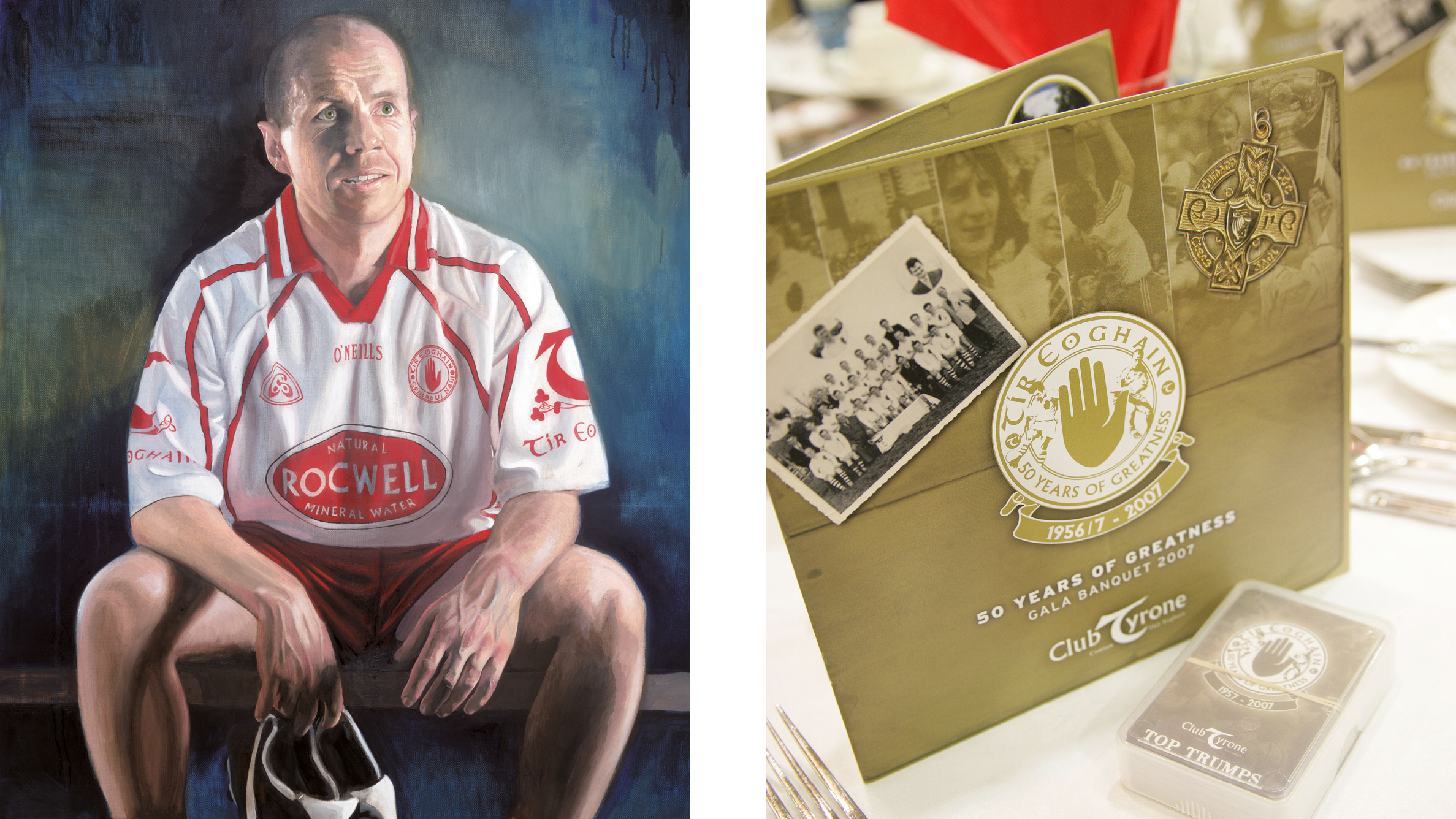
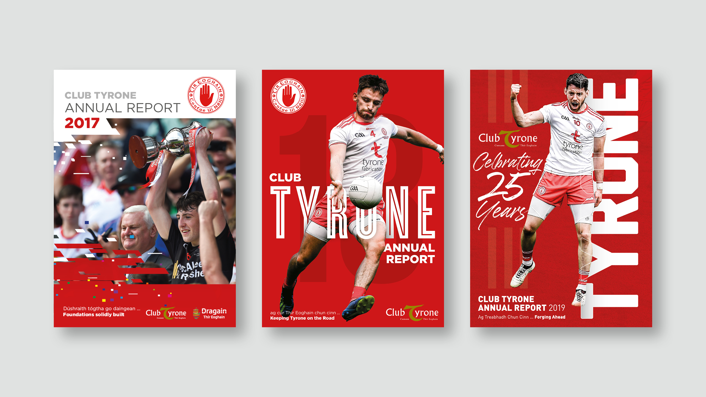
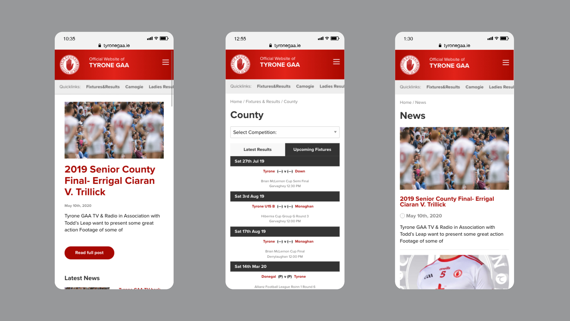
From celebratory events to practical communication tools, the look and feel remains consistent. The energy of the games mixed with a strong colour palette, good copy and photography provide the perfect platform for creating a suite of marketing materials.
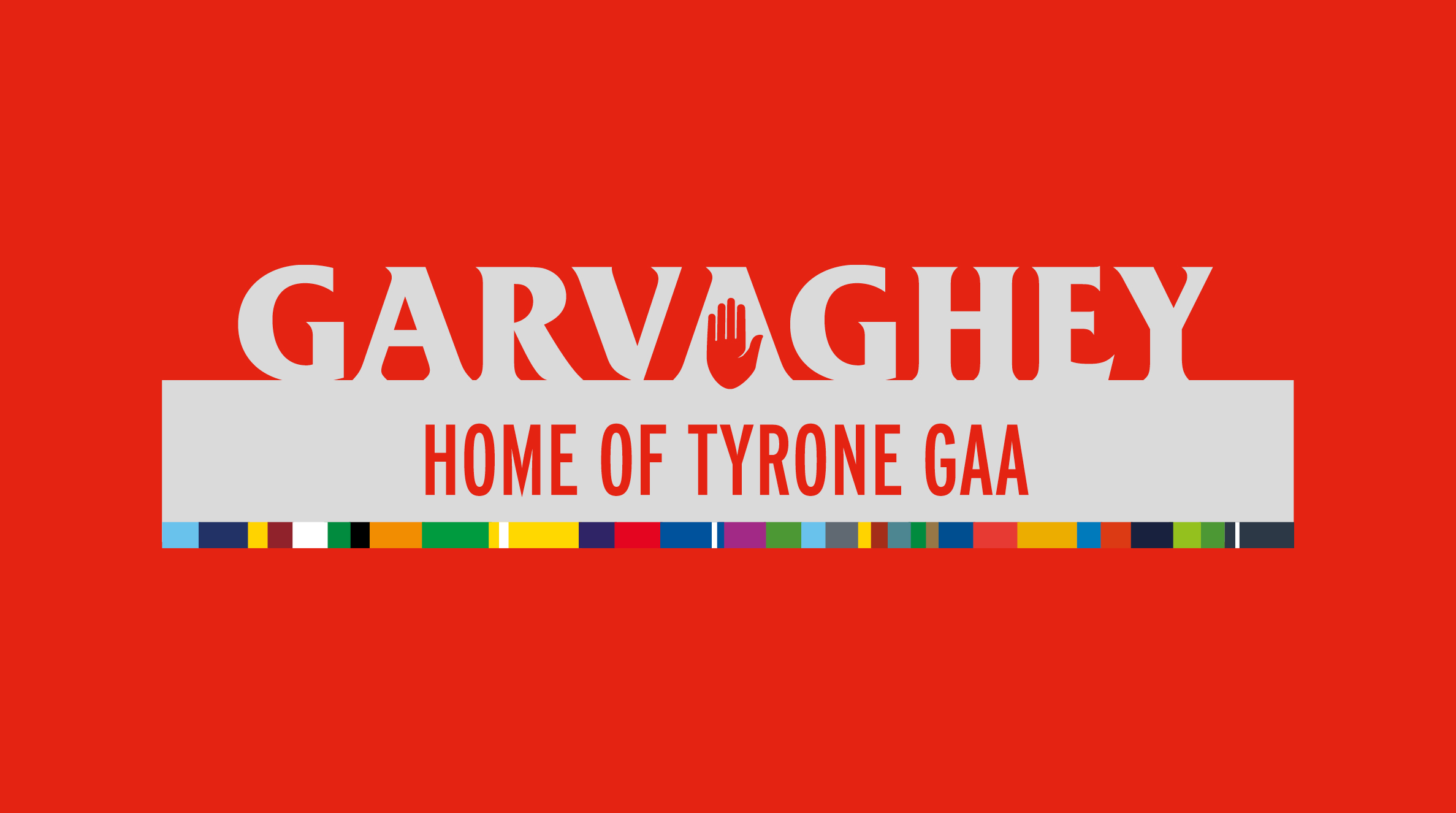
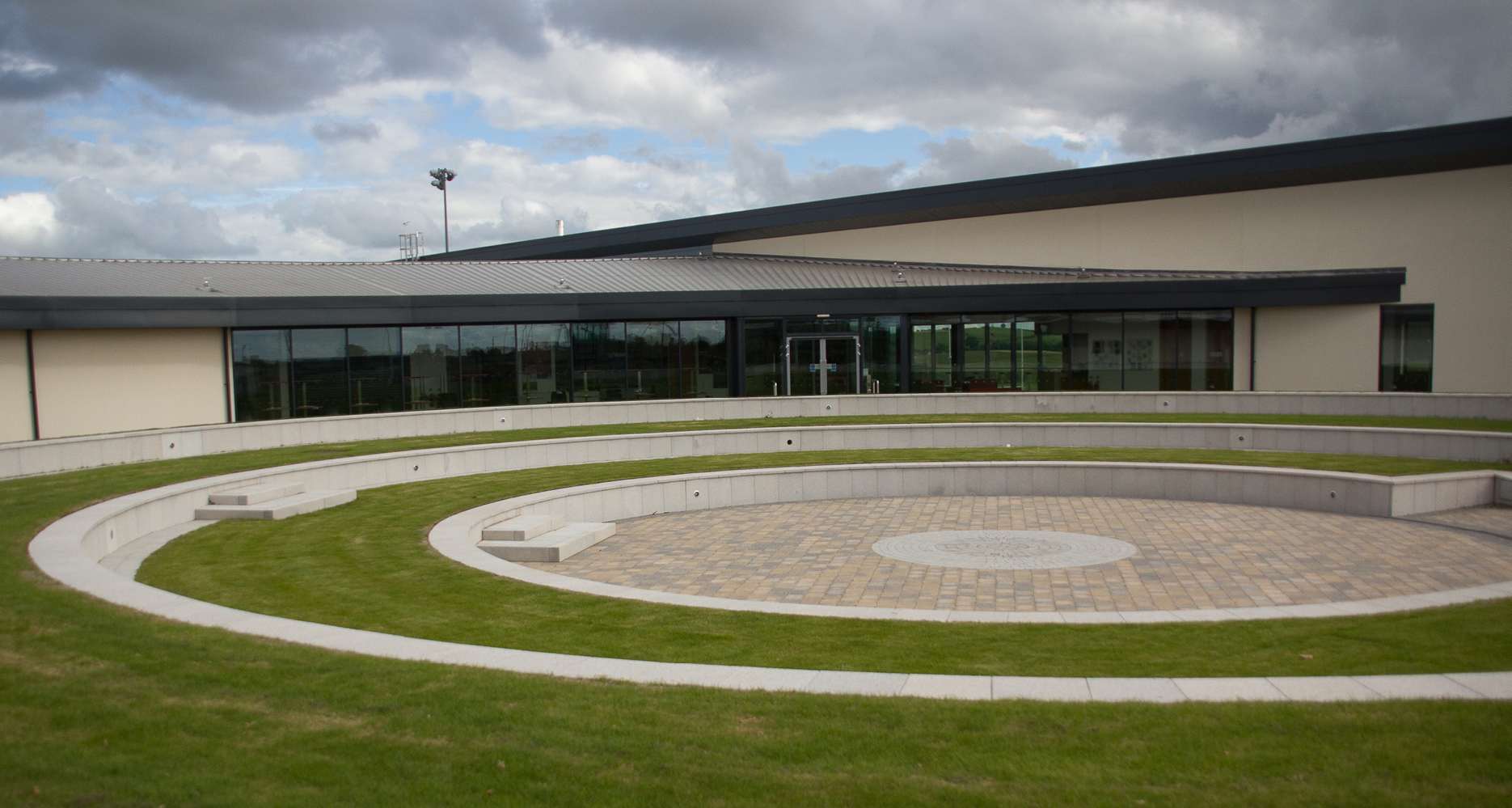
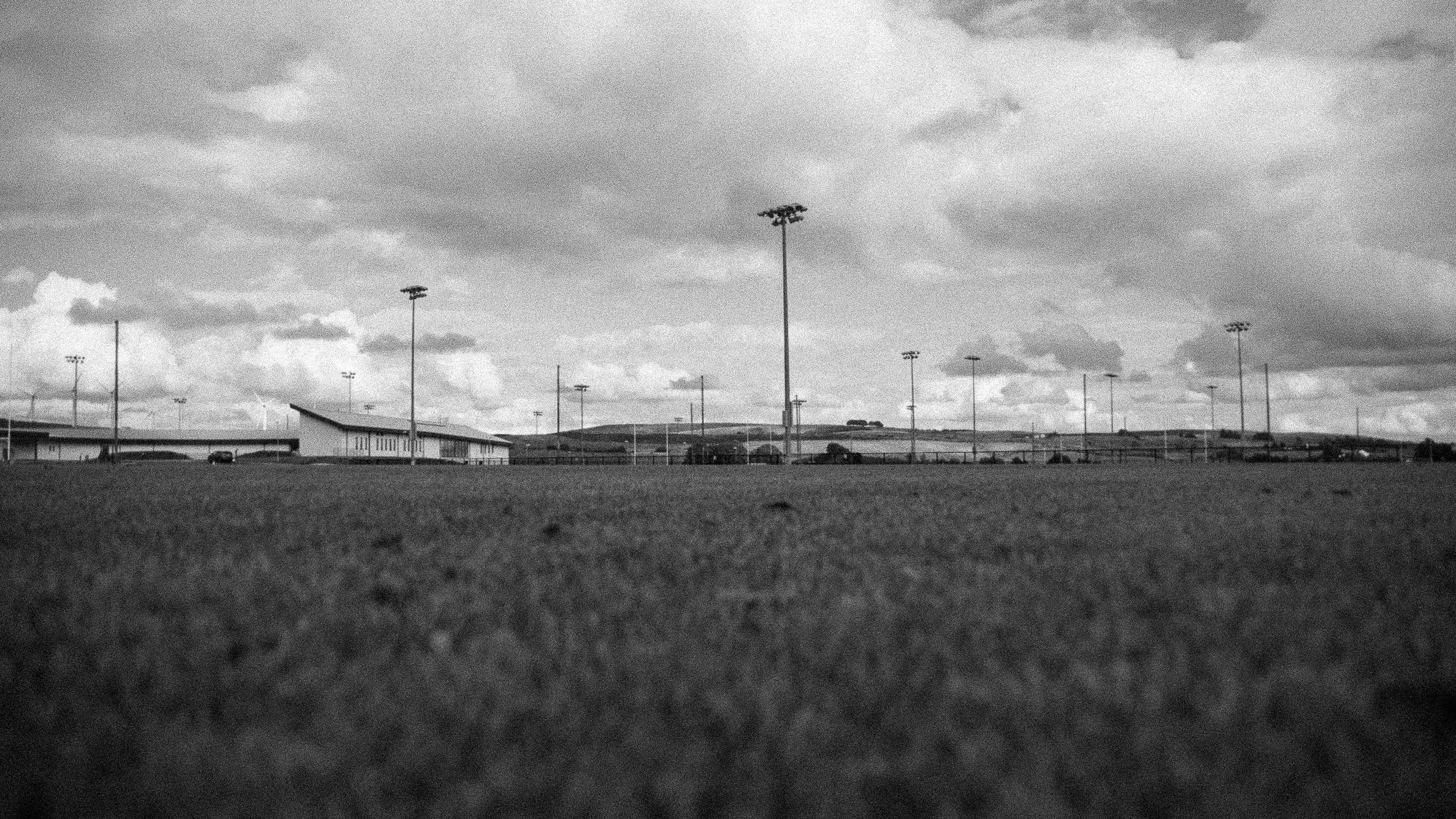
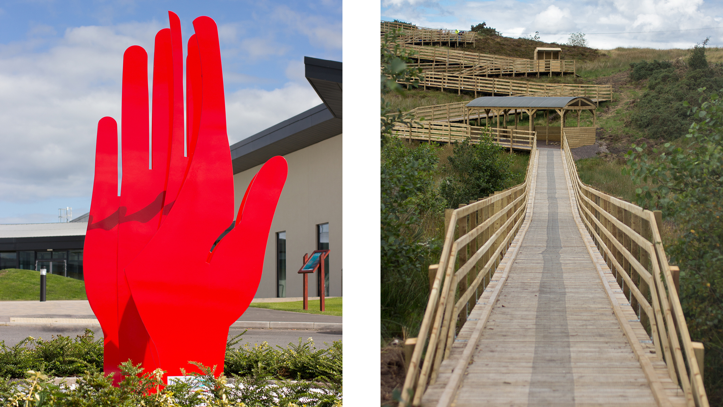
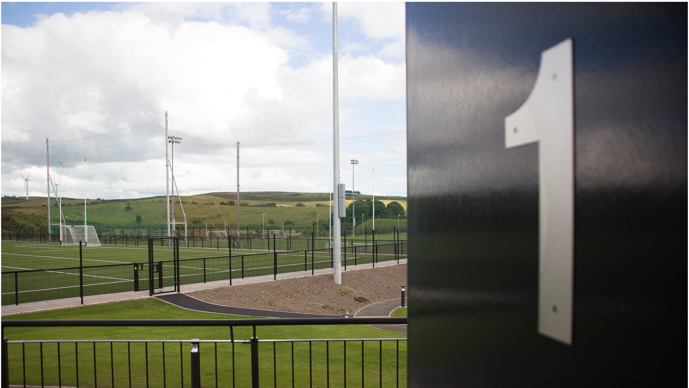
Welcome to the home of Tyrone GAA. Set on 43 acres, Garvaghey would rival any professional sports team complex in the world.
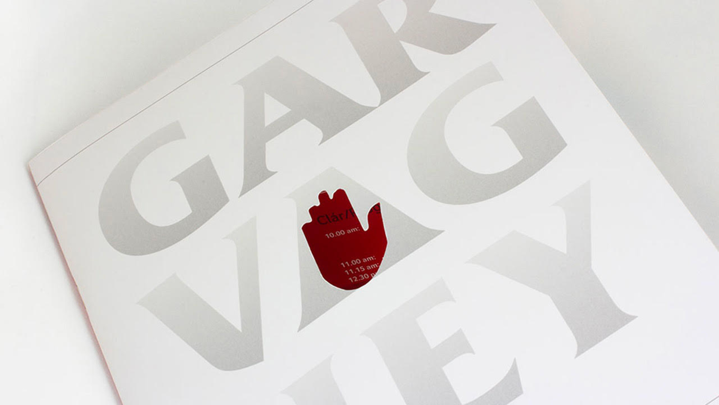
The brief in terms of the branding and the look and feel for the centre was that Garvaghey was NOT a centre of excellence, it was there for Tyrone as a whole. The colour segments on the branding are to represent each of the clubs in the county.

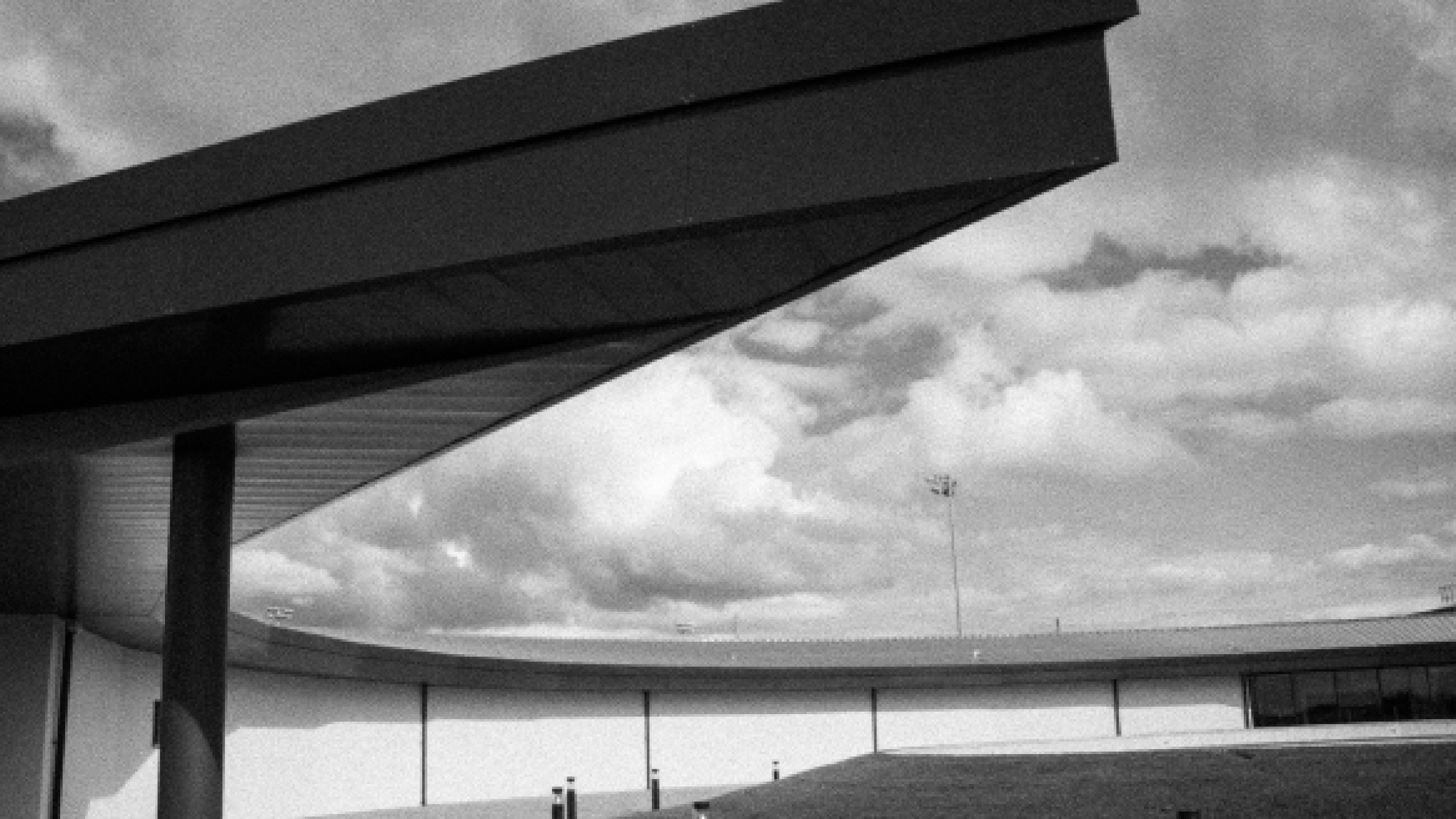
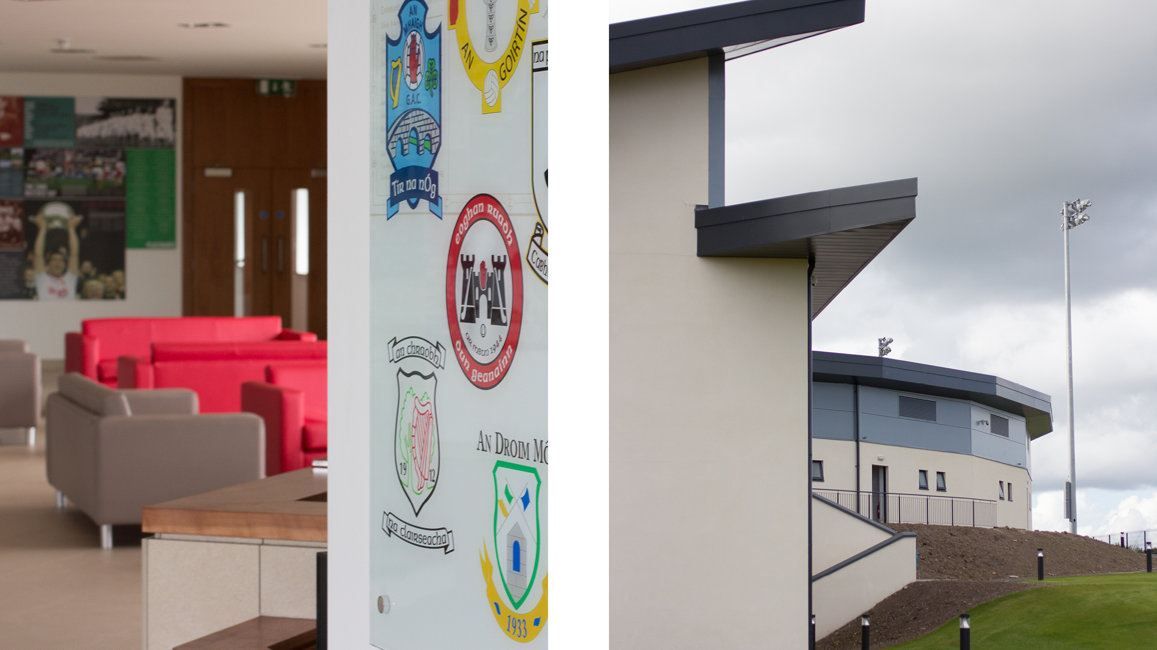
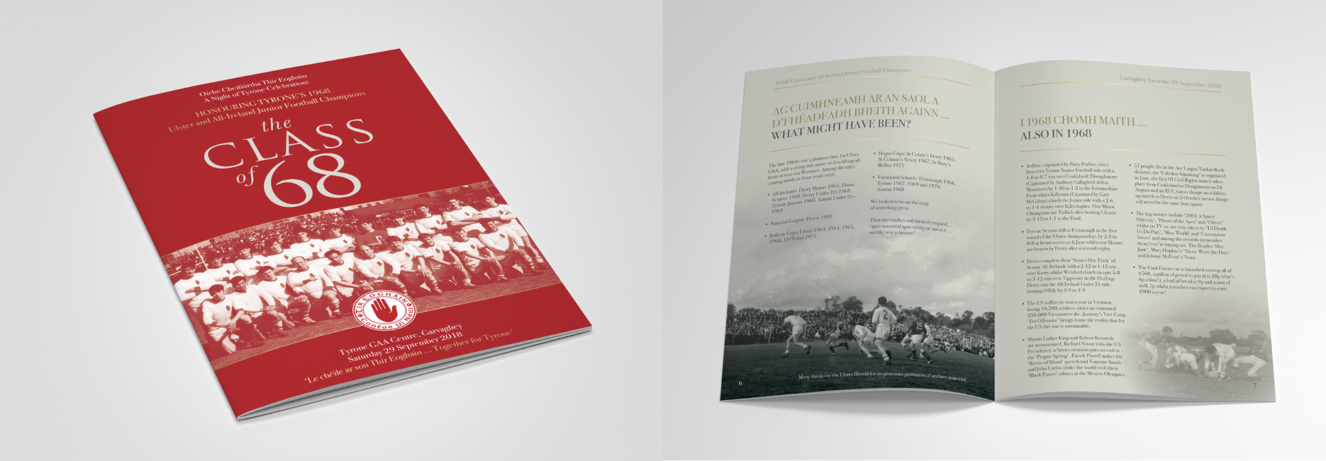
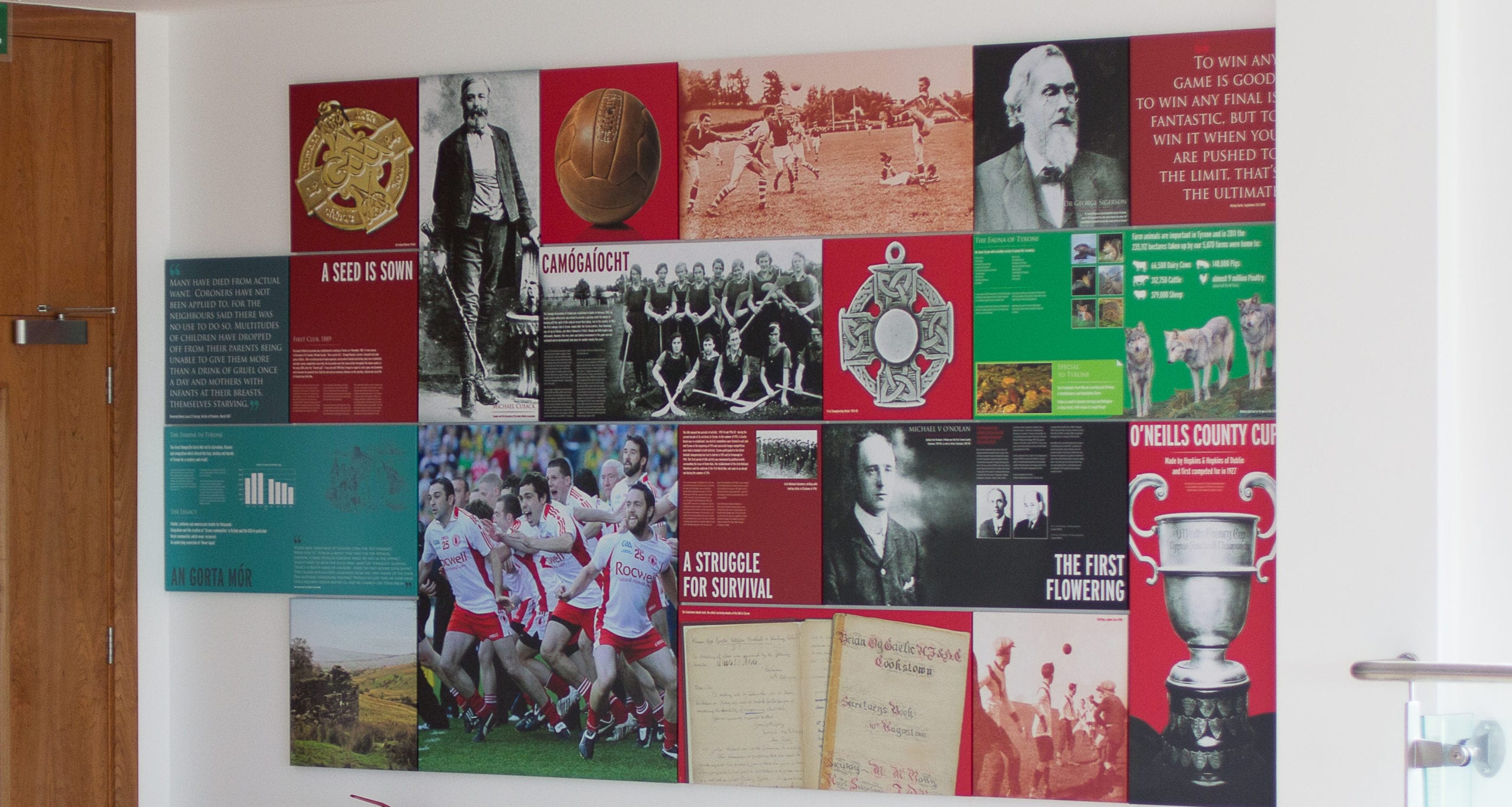
Legacy and place are to the forefront in Garvaghey. The winners are honoured but also those that paved the way.
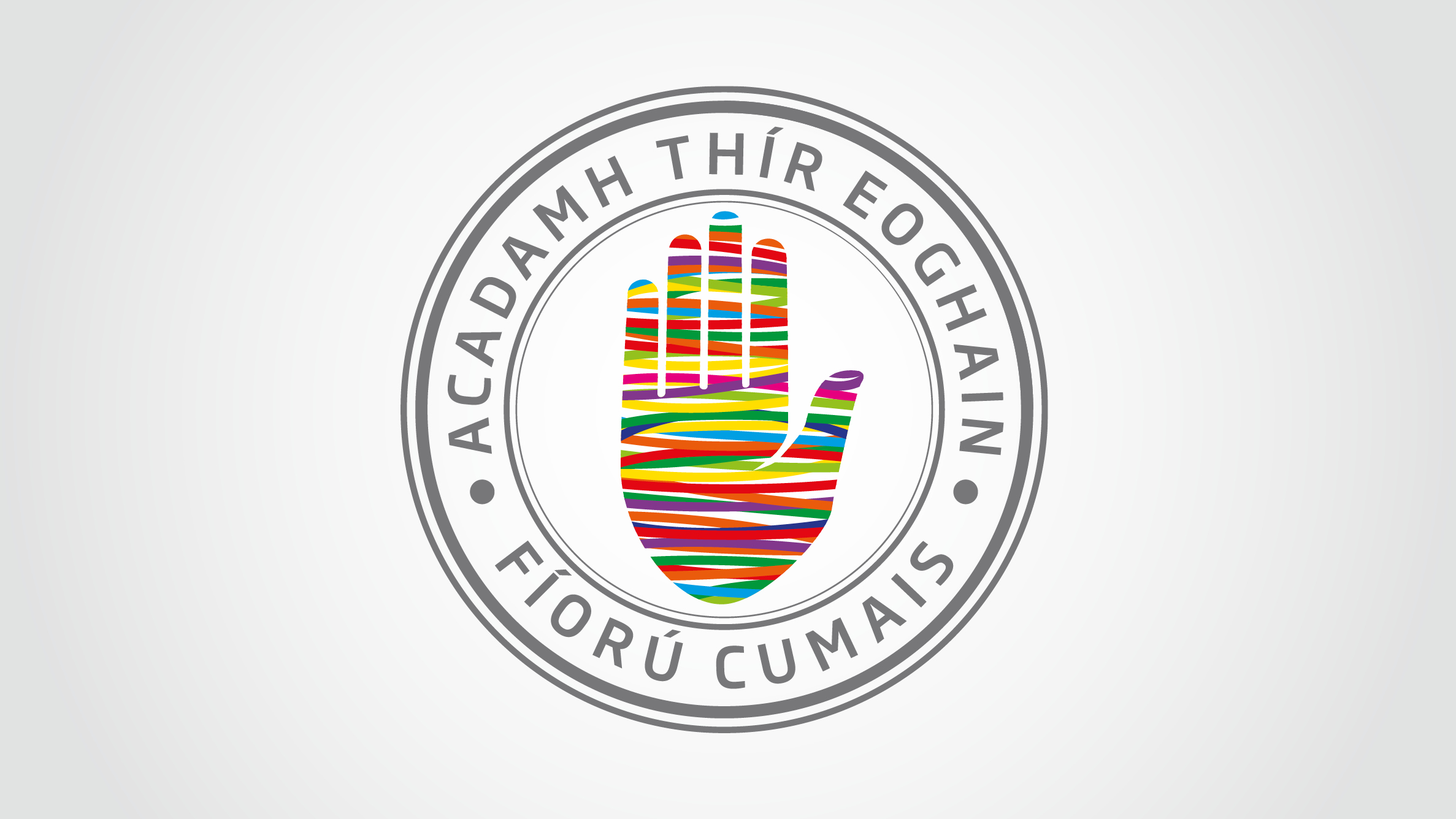
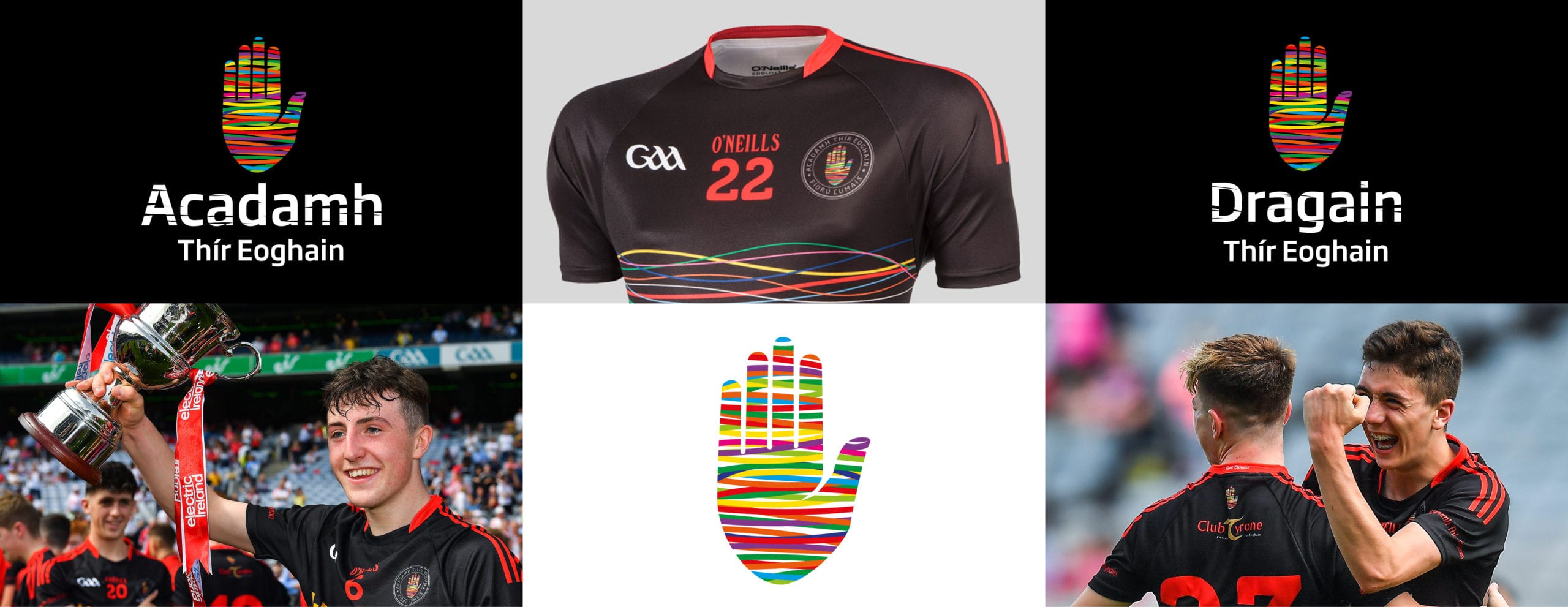
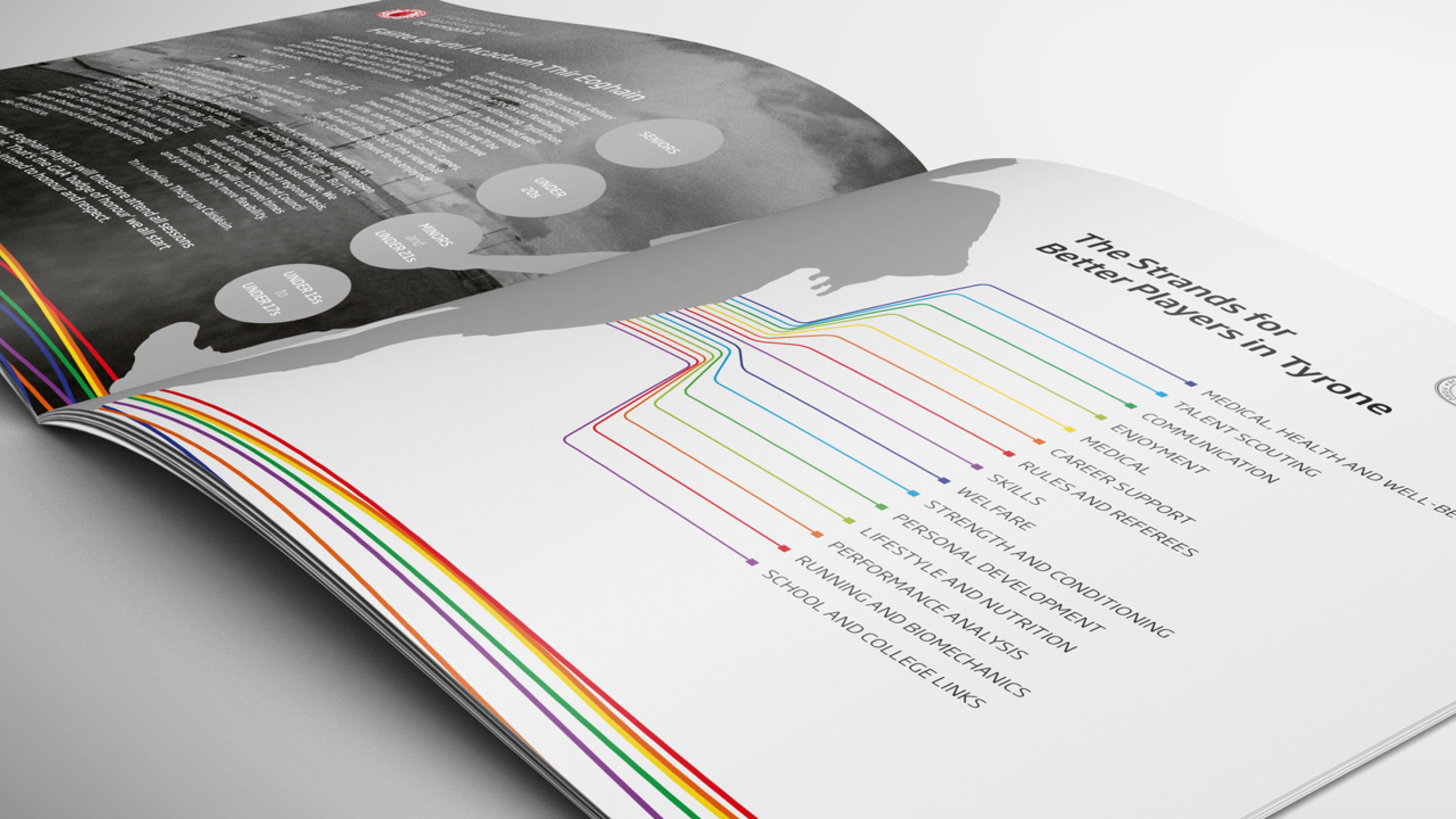
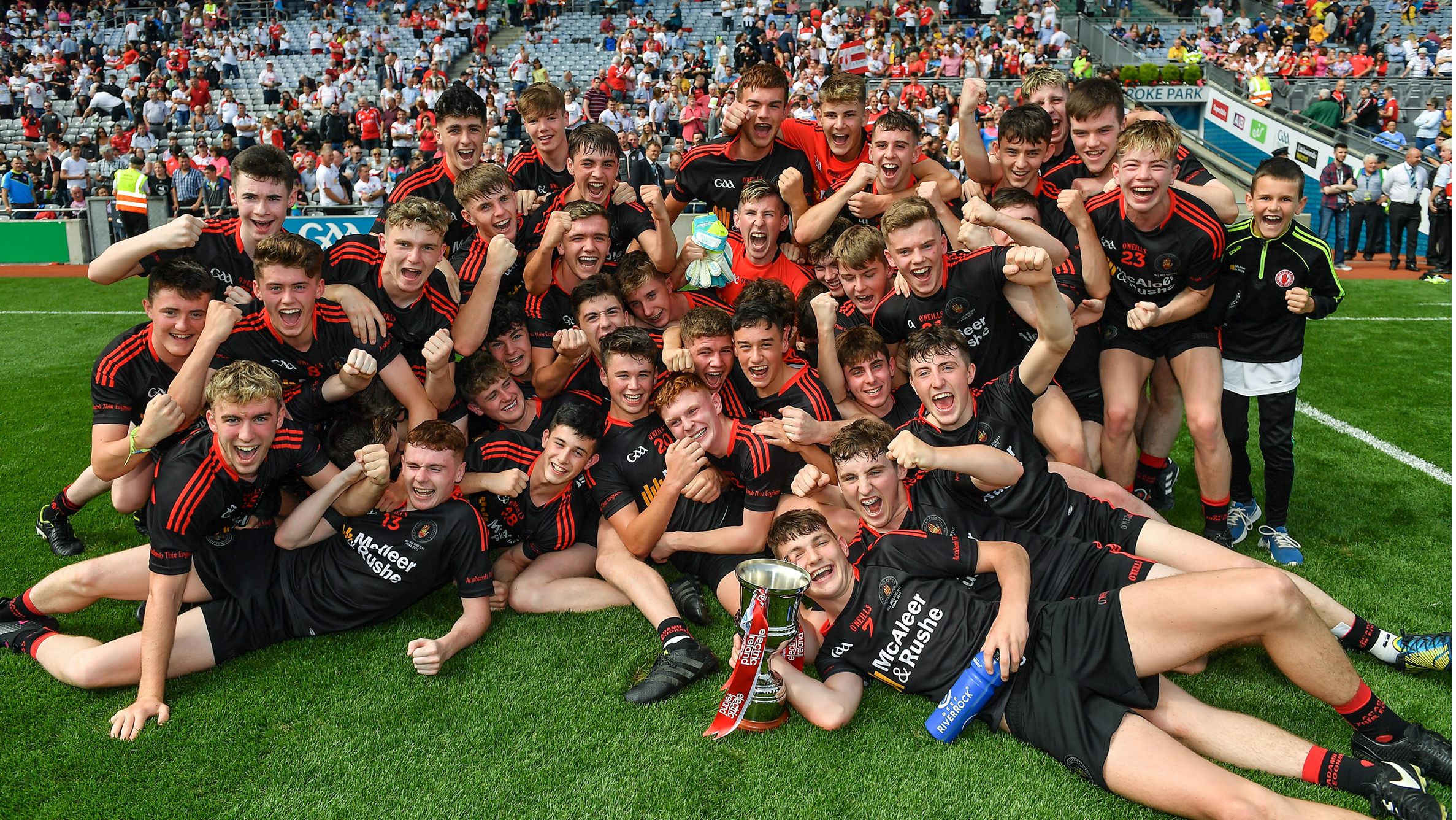
When we looked at The Academy, we wanted to be consistent while creating a message around growth and aspiration. Here, instead of a red hand, we chose a bright and vibrant colour palette. The Academy branding includes all the colours of Tyrone GAA clubs. The idea here is that young athletes get used to playing with players from other clubs, in the hope that they graduate to wearing the famous red and white when they are older.
Tyrone GAA is an amateur organisation but they recognise the value of their brand and can leverage its power to help achieve their goals.
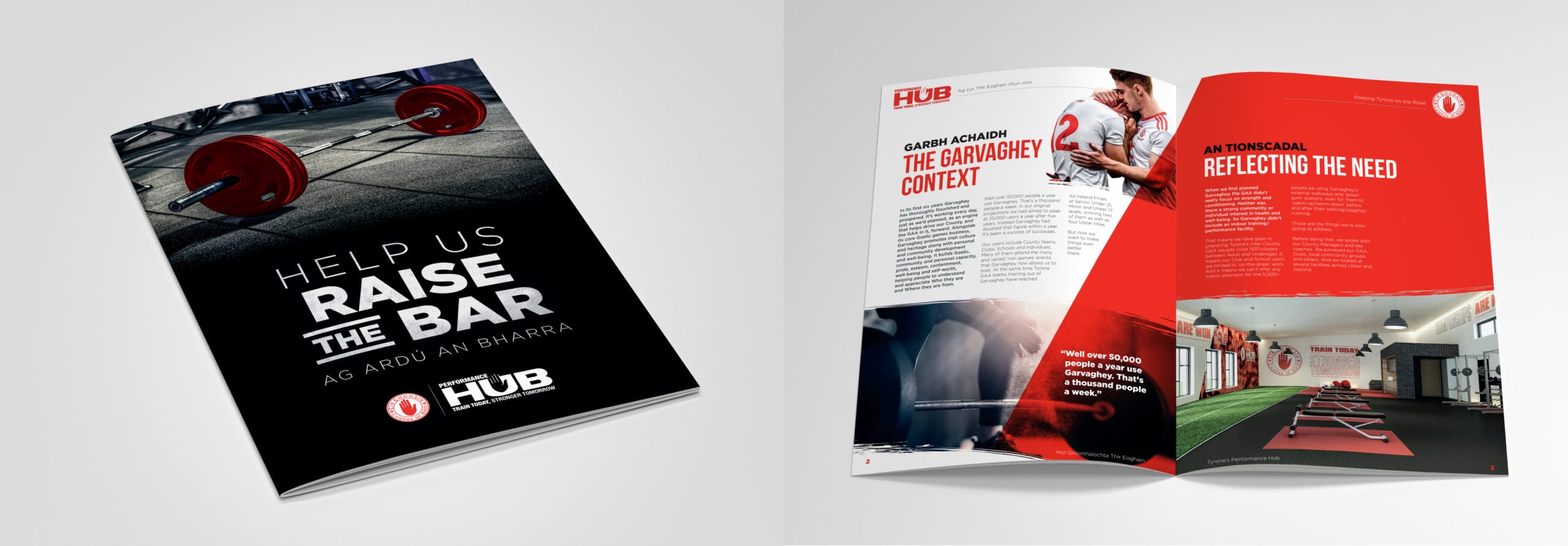
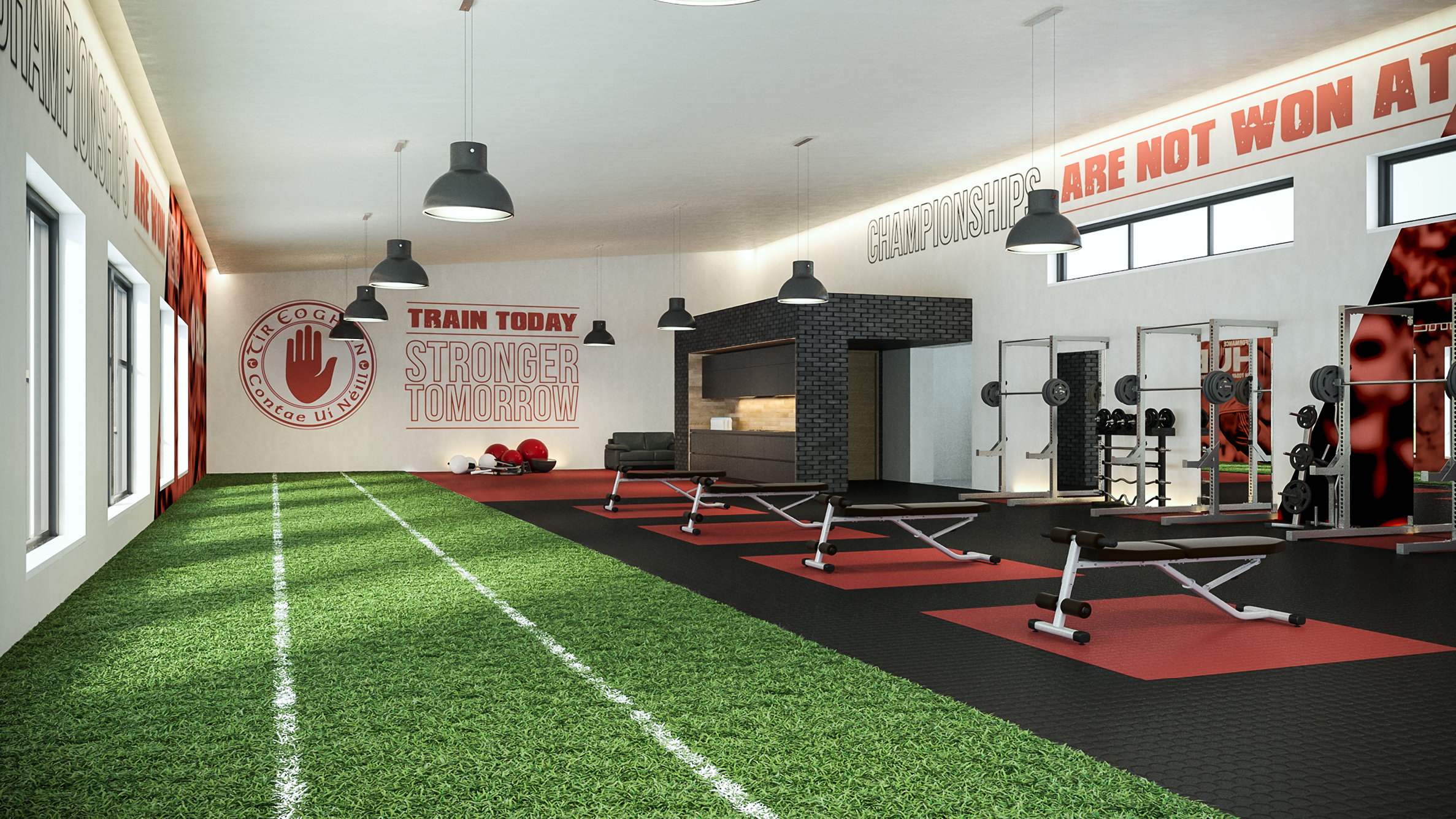
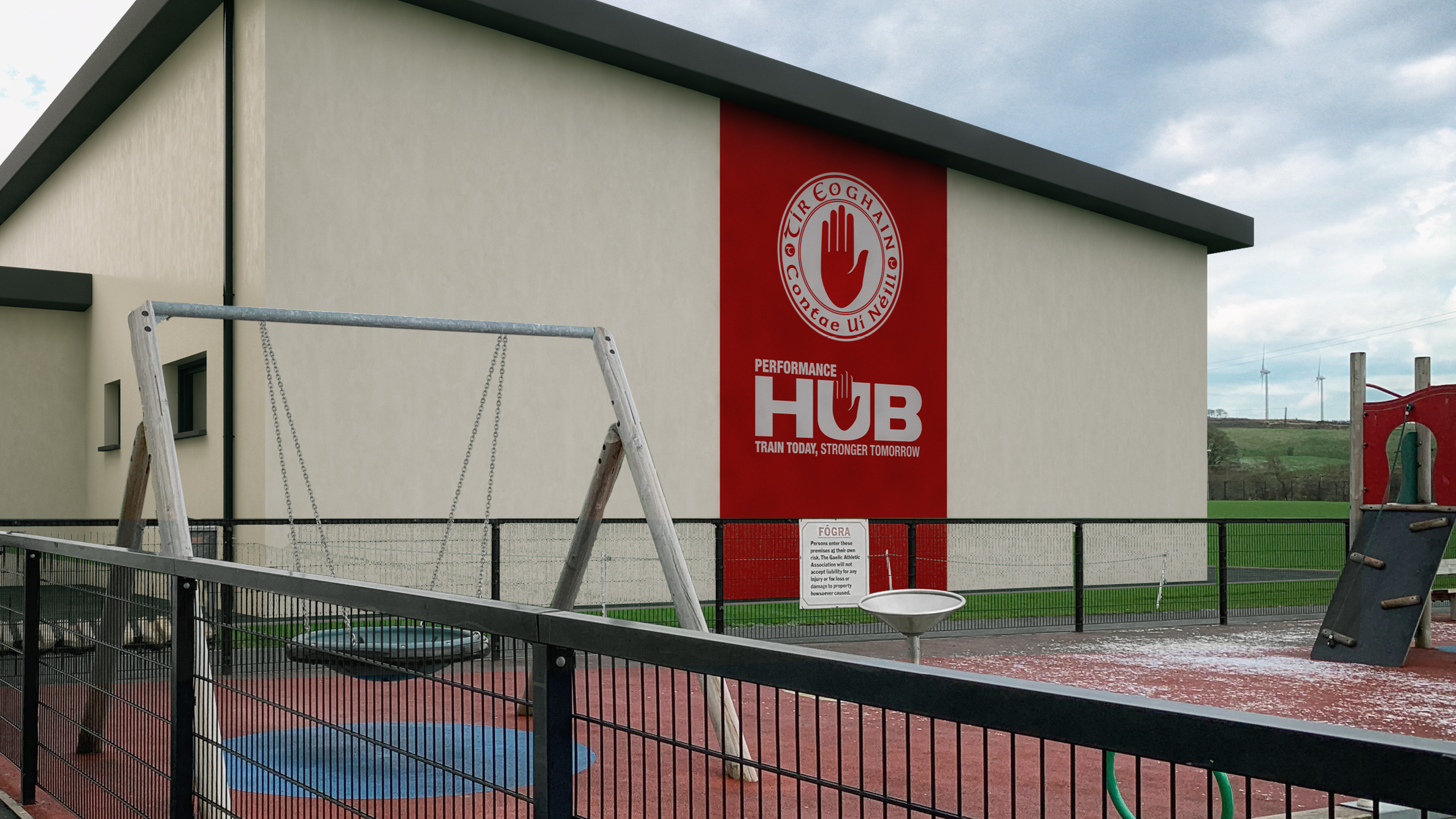
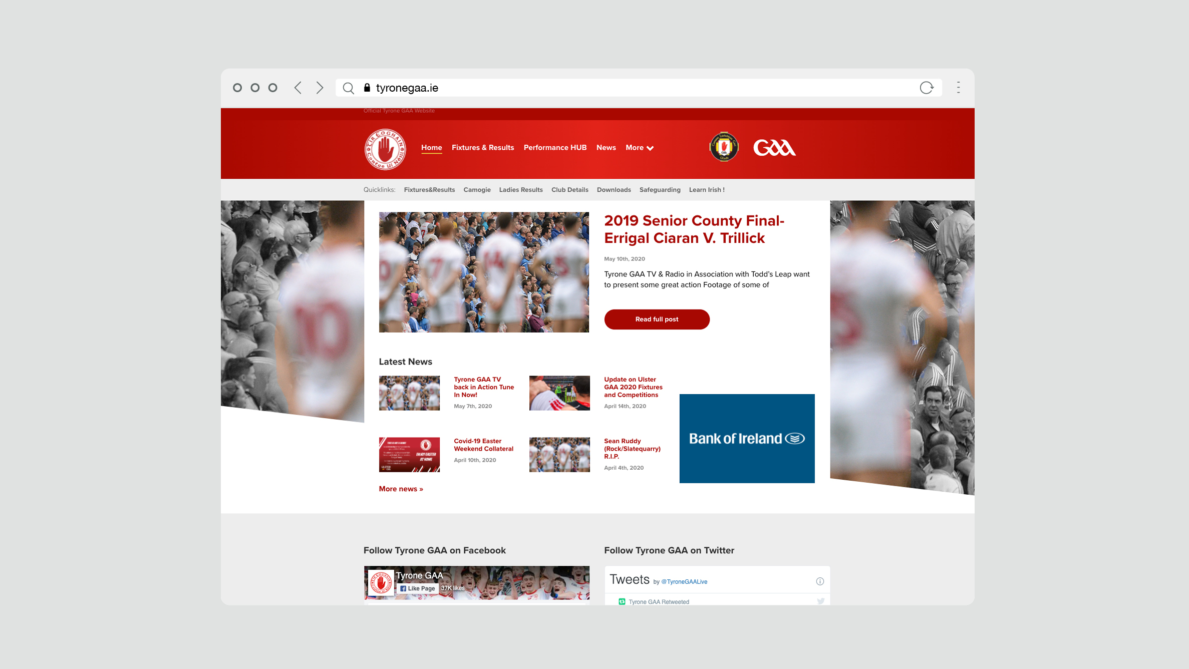
When a project like the HUB is being developed, branding and marketing are in the mix early. That’s because Tyrone GAA realise its value in raising funds, but also its longterm value for those using the facility, who benefit from being part of one of the most successful and recognised brands in the country.
