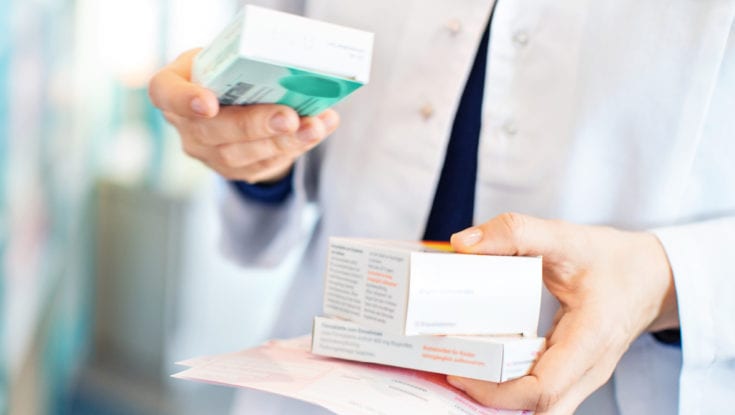
The Client
Hickey’s Pharmacy opened its first pharmacy in Northside Shopping Centre, Dublin, in 1995. It now employs over 350 people in 36 stores throughout the country.
The Challenge
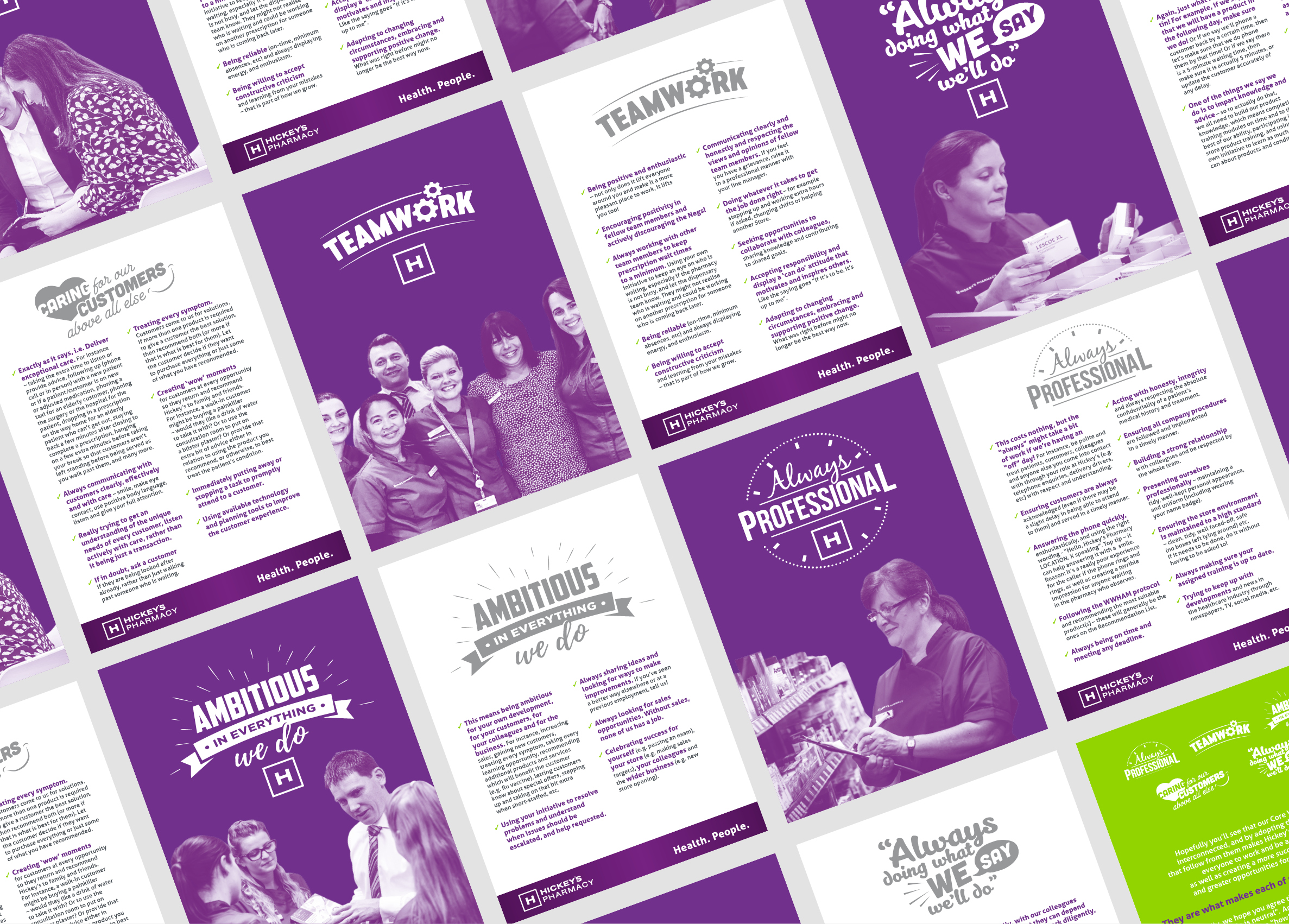
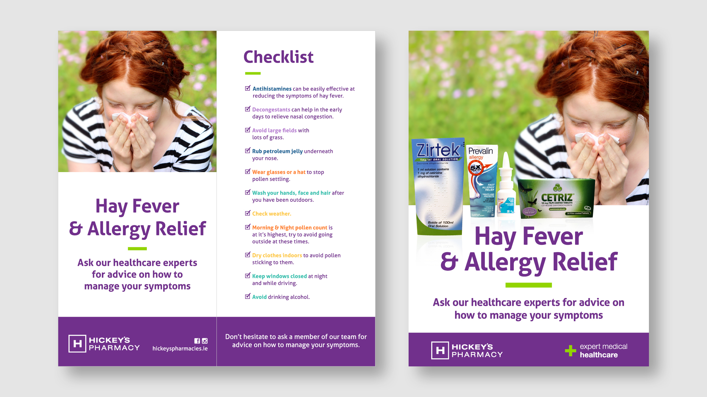
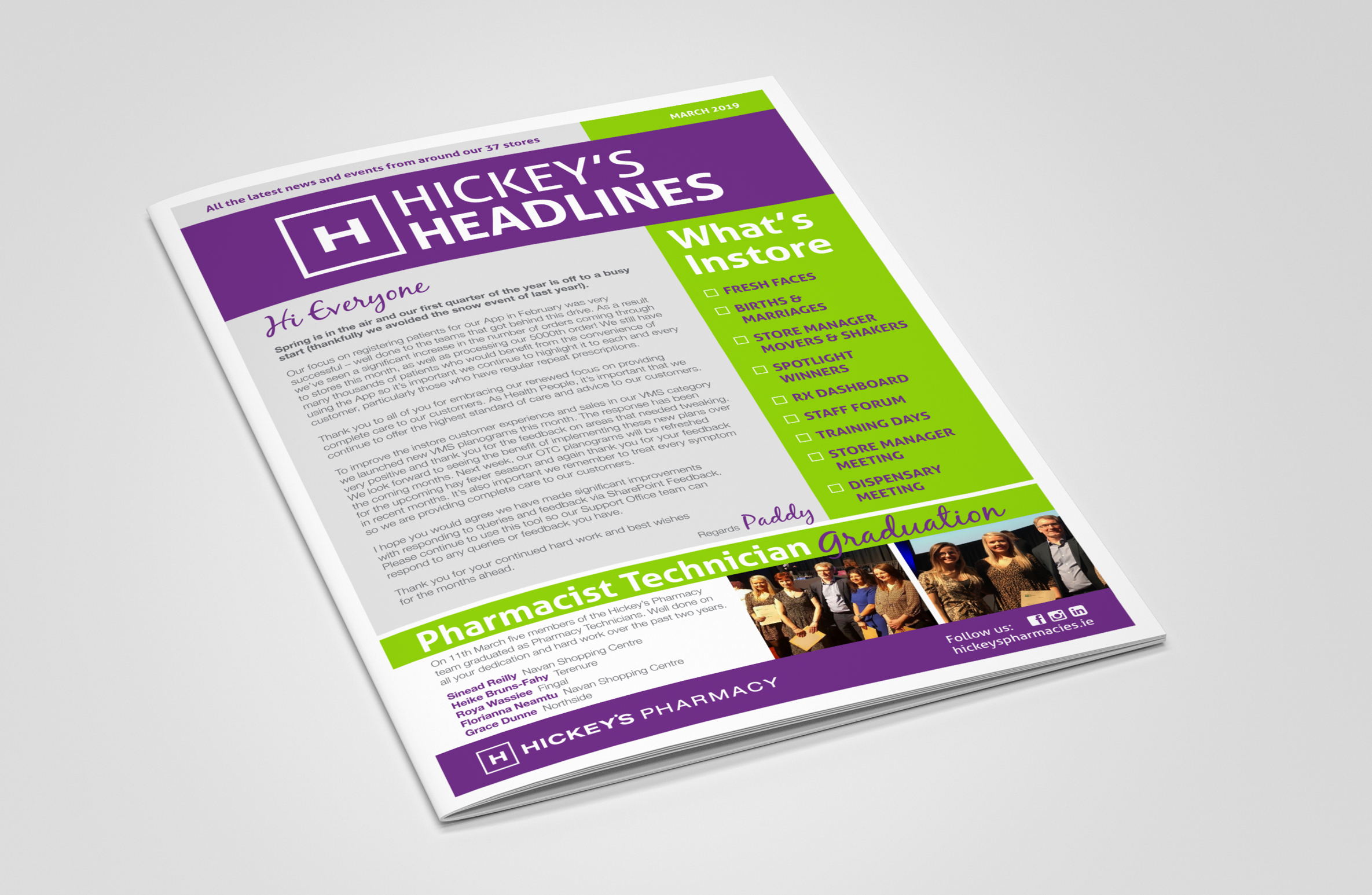
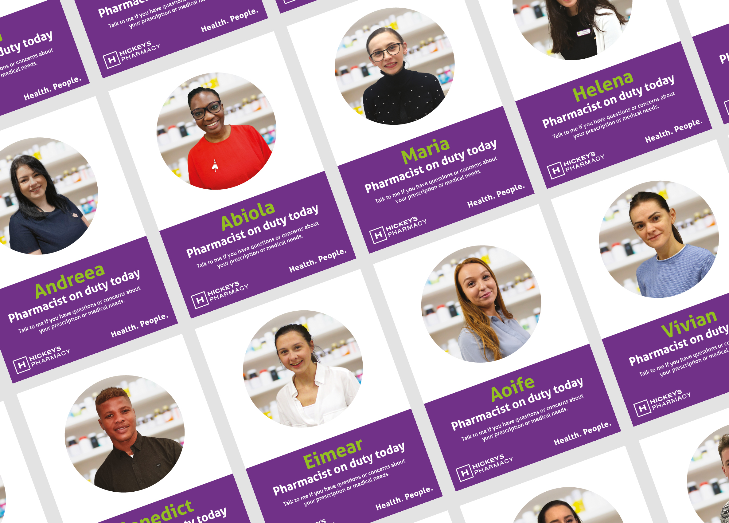
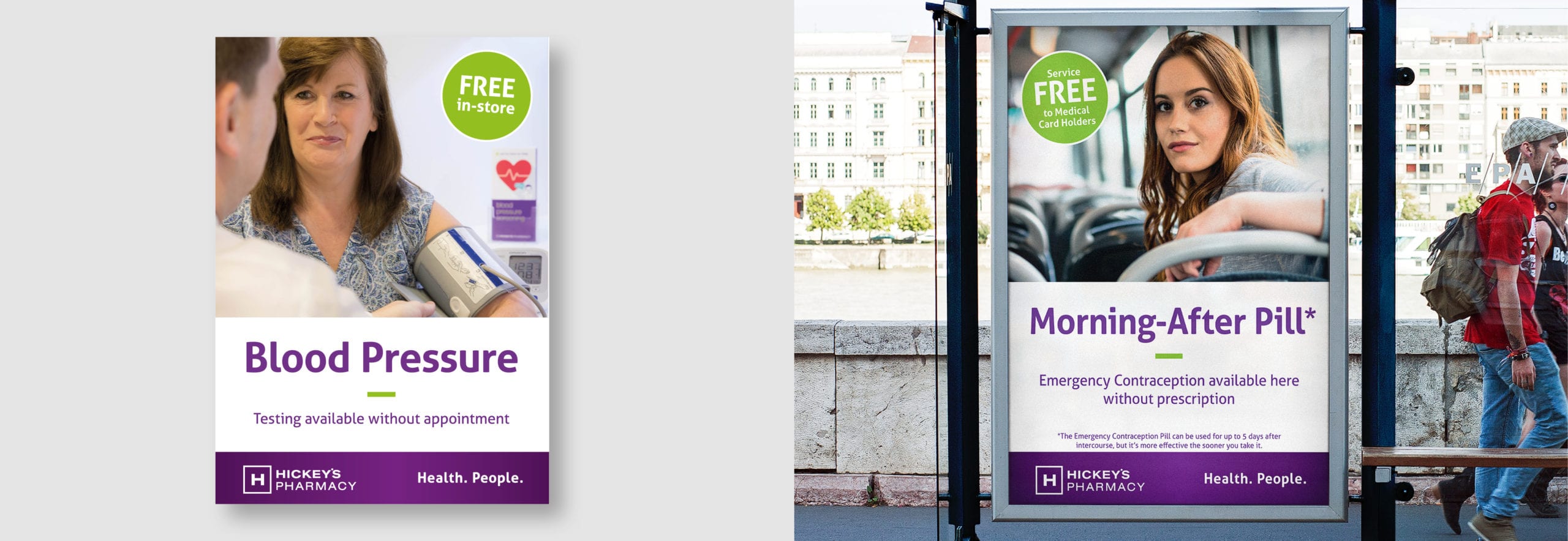
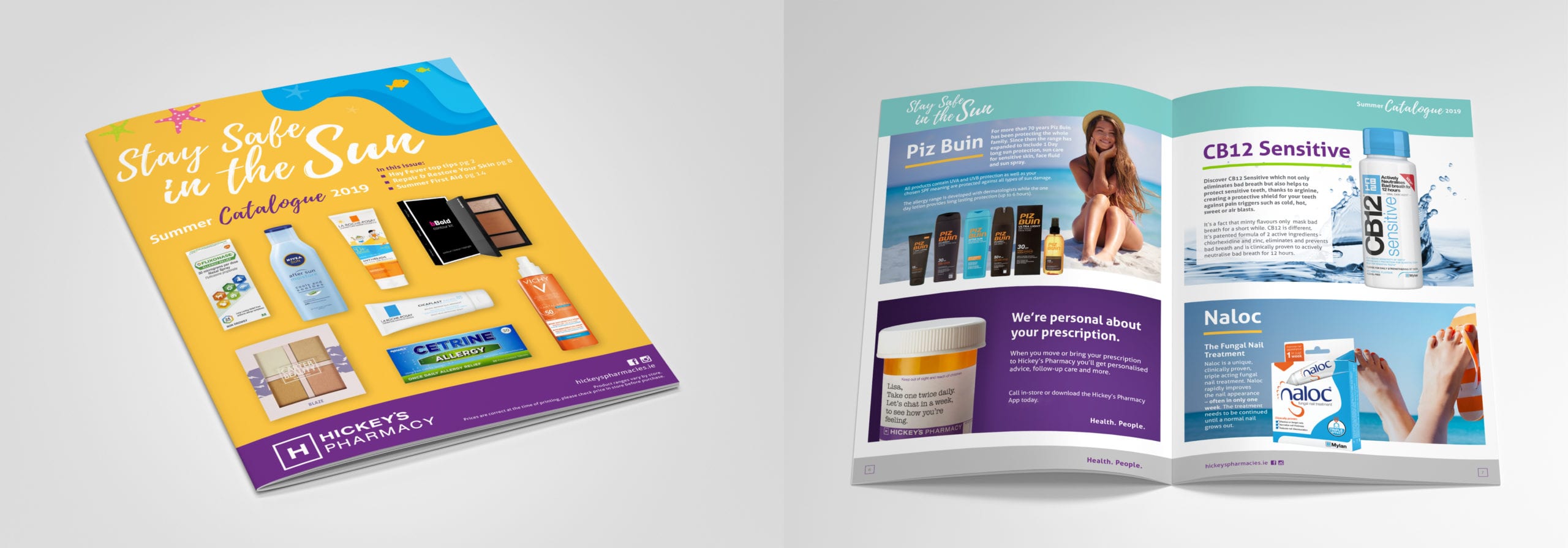
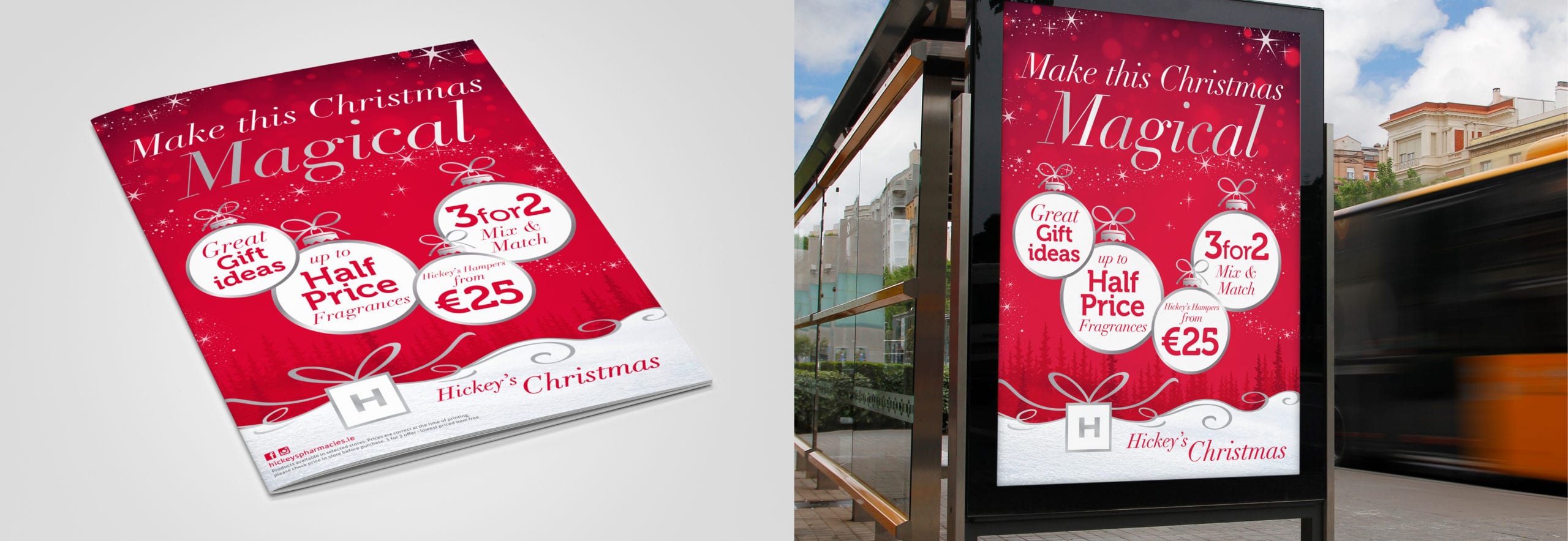
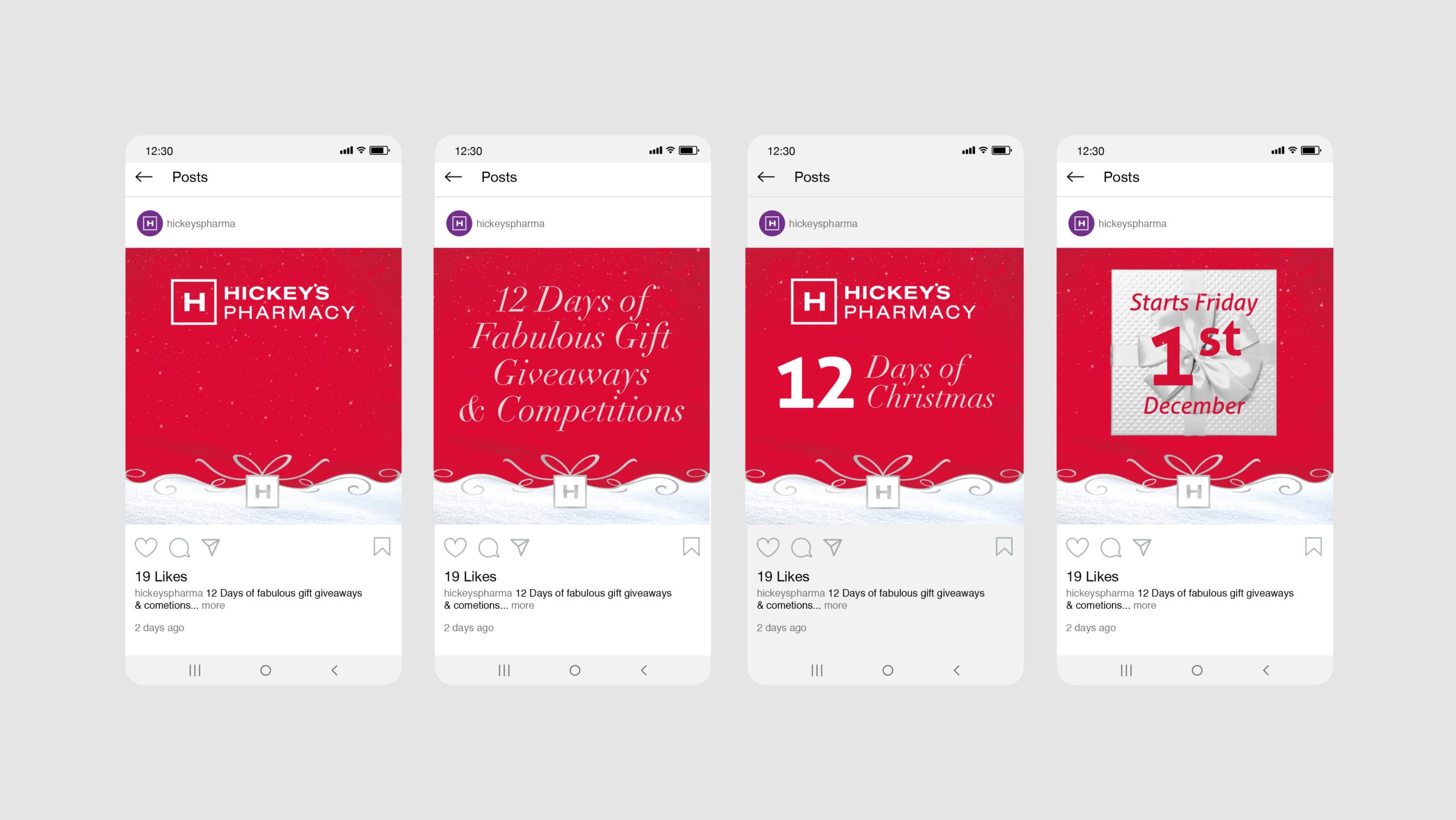
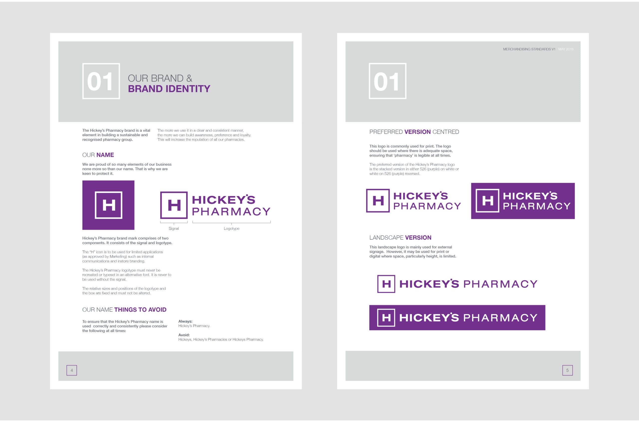
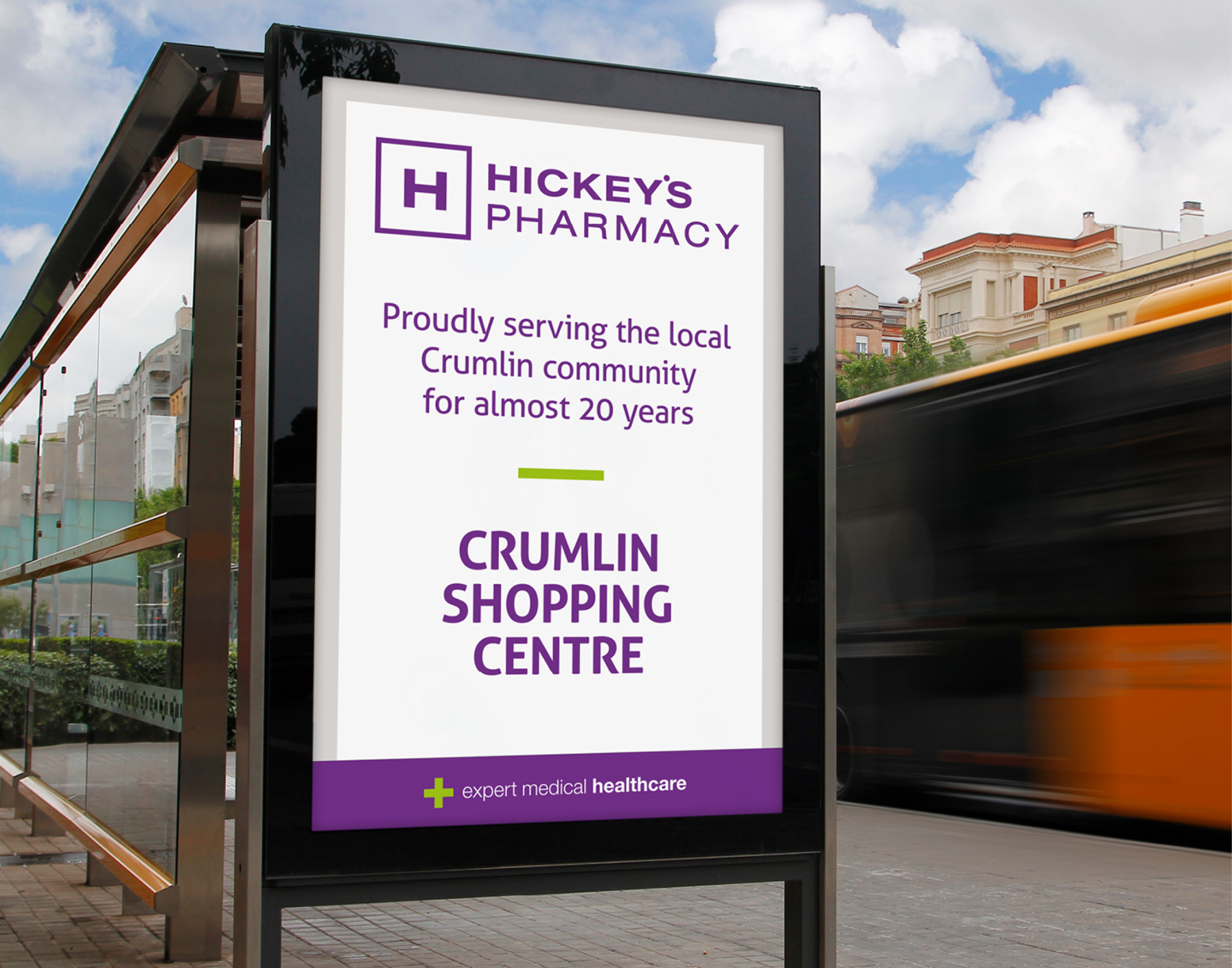
The marketing team felt the need to review and revise the current branding, including in-store and promotional materials. The core elements of the branding were in place, the Hickey’s ‘H’ and strong purple colour, however they wanted to create their own visual tone across all communications and their 36 pharmacies.
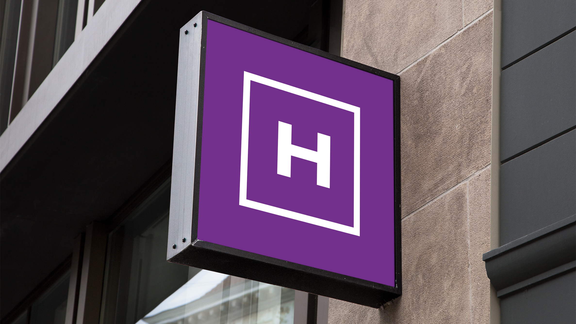
We needed to let the identity breathe, creating the right balance in terms of weight and colour.
The Result
Working on the balance between the ‘mark’ and wording was integral to the correct use of the branding. Additions to the colour palette, typography and styling allowed us to put guides in place that could be integrated into the store merchandising and across external communication quite quickly.
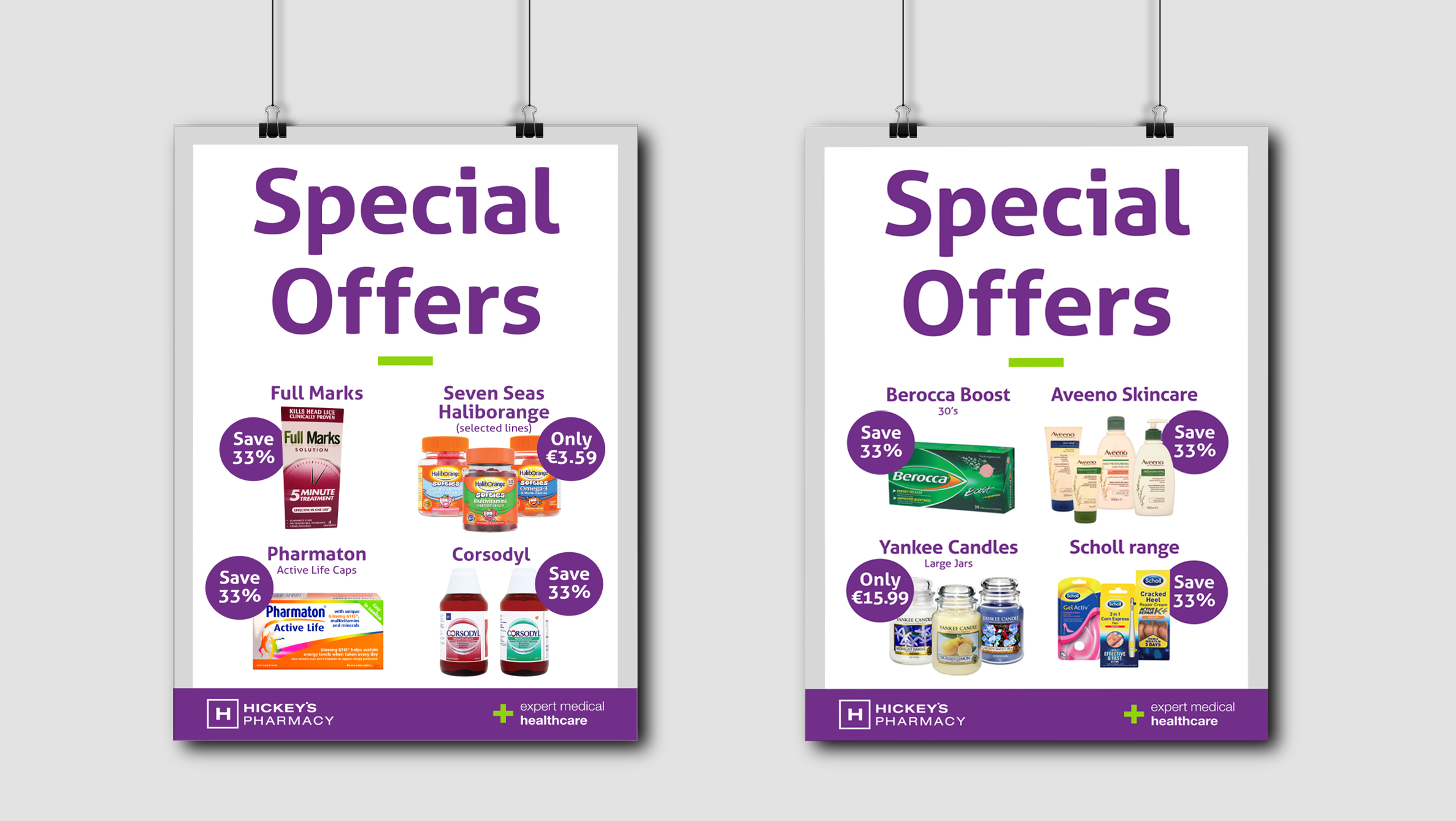
The colour palette needed a tweak and then knowing how to use that palette was key. It was important that the purple did not dominate what we were trying to promote!