Michaela Foundation
The Michaela Foundation is inspired by the life of Michaela McAreavey, née Harte. It runs summer camps and other initiatives for young people that encourage practising the values Michaela, her family and friends hold dear.
The Client
The Michaela Foundation was set up following the tragic death of Michaela McAreavey (Harte) in 2011. Any GAA fan would know or know of Michaela. Born Michaela Harte, she was a 27-year-old Irish language teacher from Glencull, County Tyrone, and the daughter of Tyrone manager Mickey Harte. A life filled with so much potential was tragically ended on her honeymoon.
The Challenge
What happened touched so many people around the world. John McAreavey, Michaela’s husband, and the Harte family felt it was important that something be done in Michaela’s memory, something to reflect who she was and the values she lived by. John and Mickey Harte came to our office with a loose brief to create an identity for the Michaela Foundation.
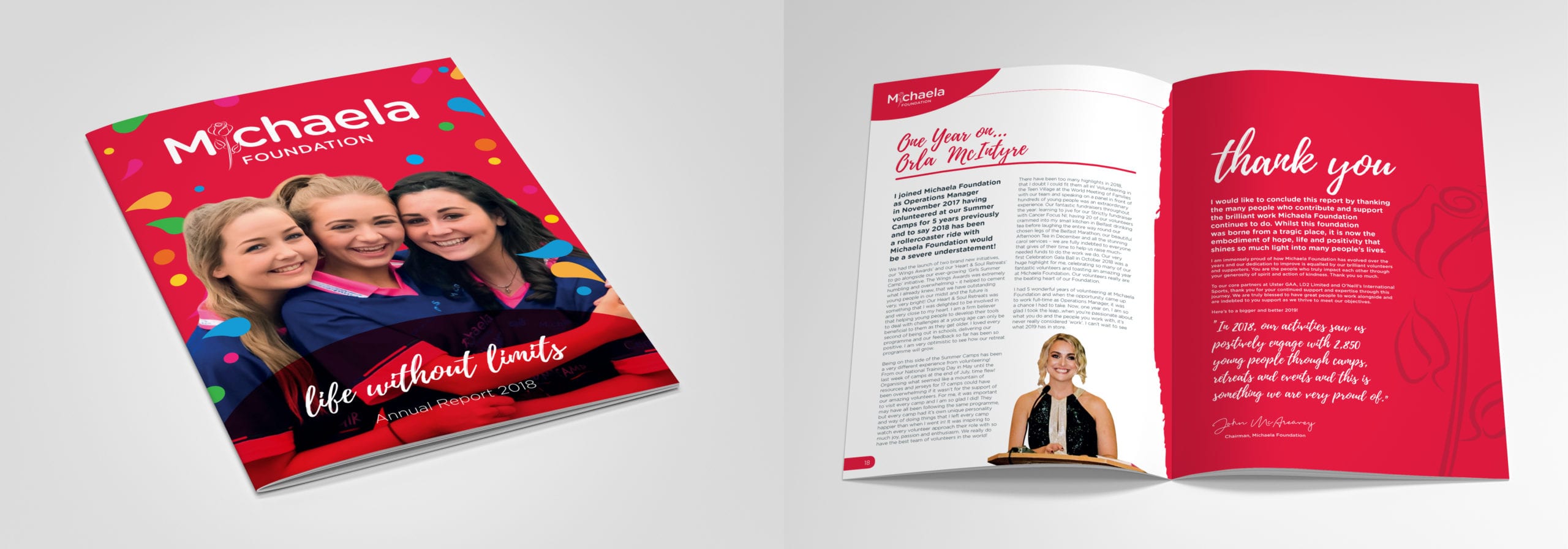
The Result
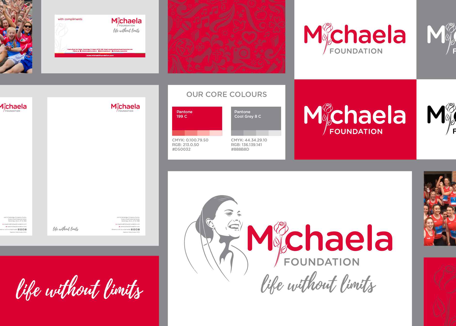
It’s important to say that it’s okay to change, to take another look. As designers you need to be able to look at your own work with a critical eye. It’s not even that we got something very wrong at the outset, but no-one really knew where the Foundation would go – it needed time to find its feet, to find its place. And we needed to evolve with it when it did.


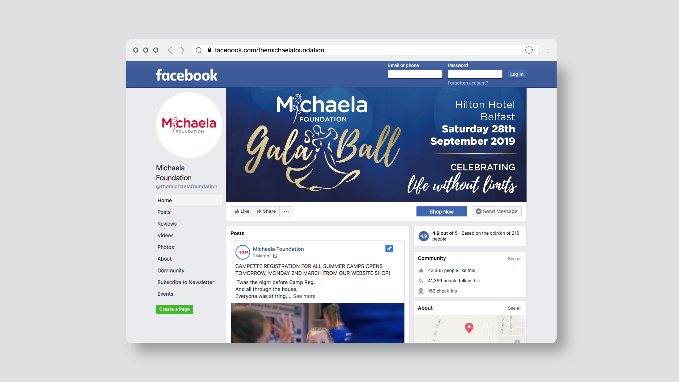
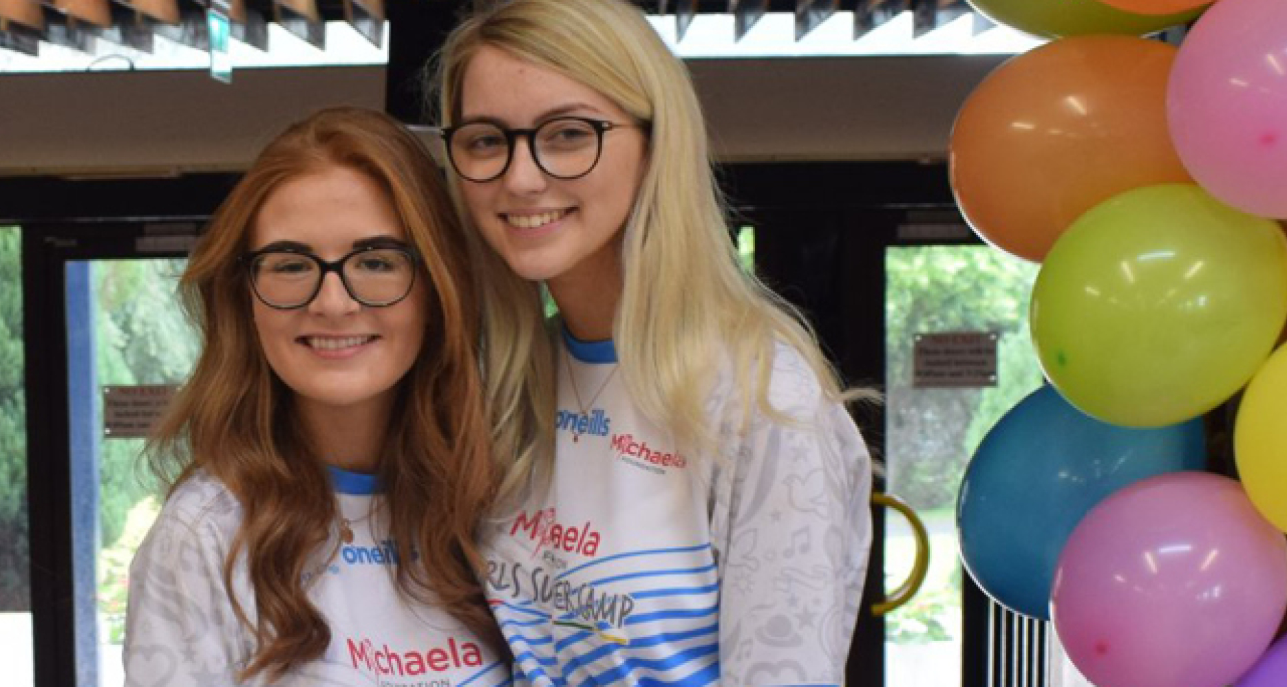
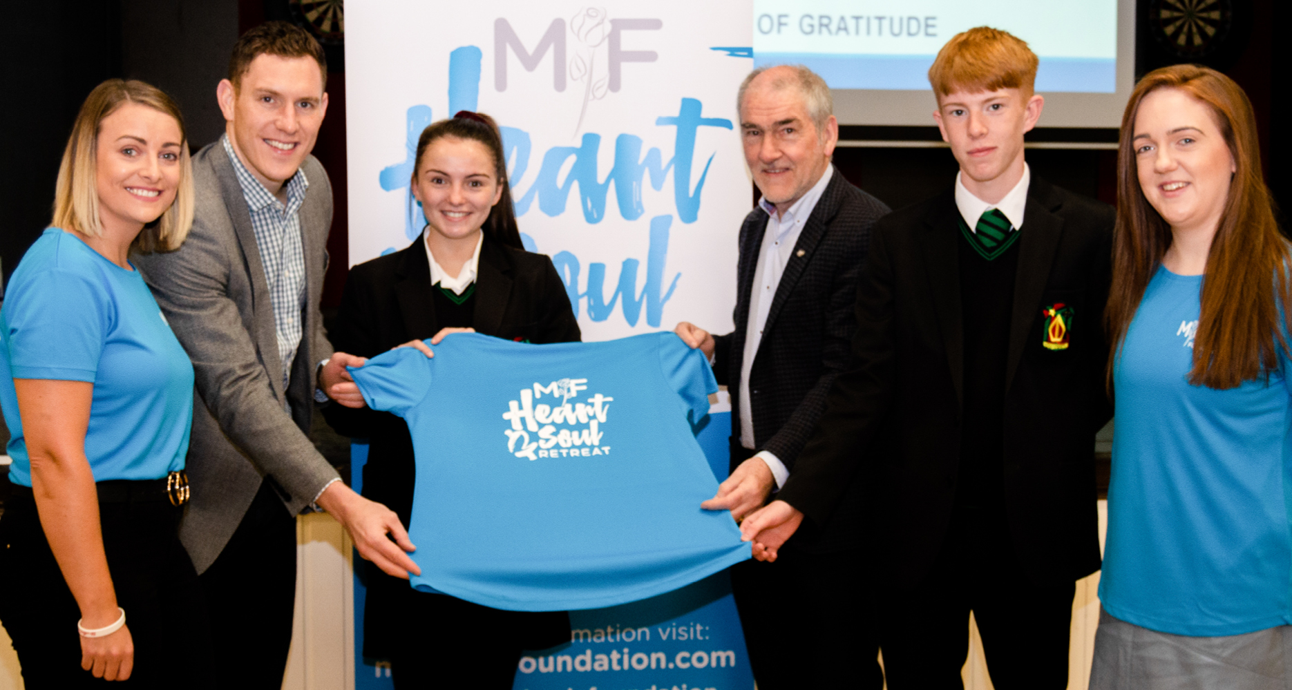
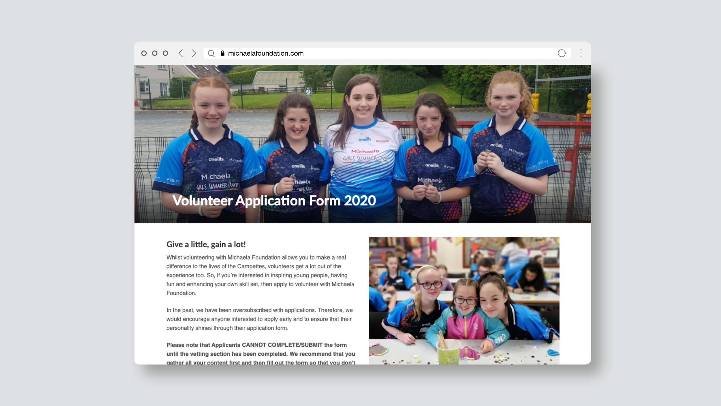
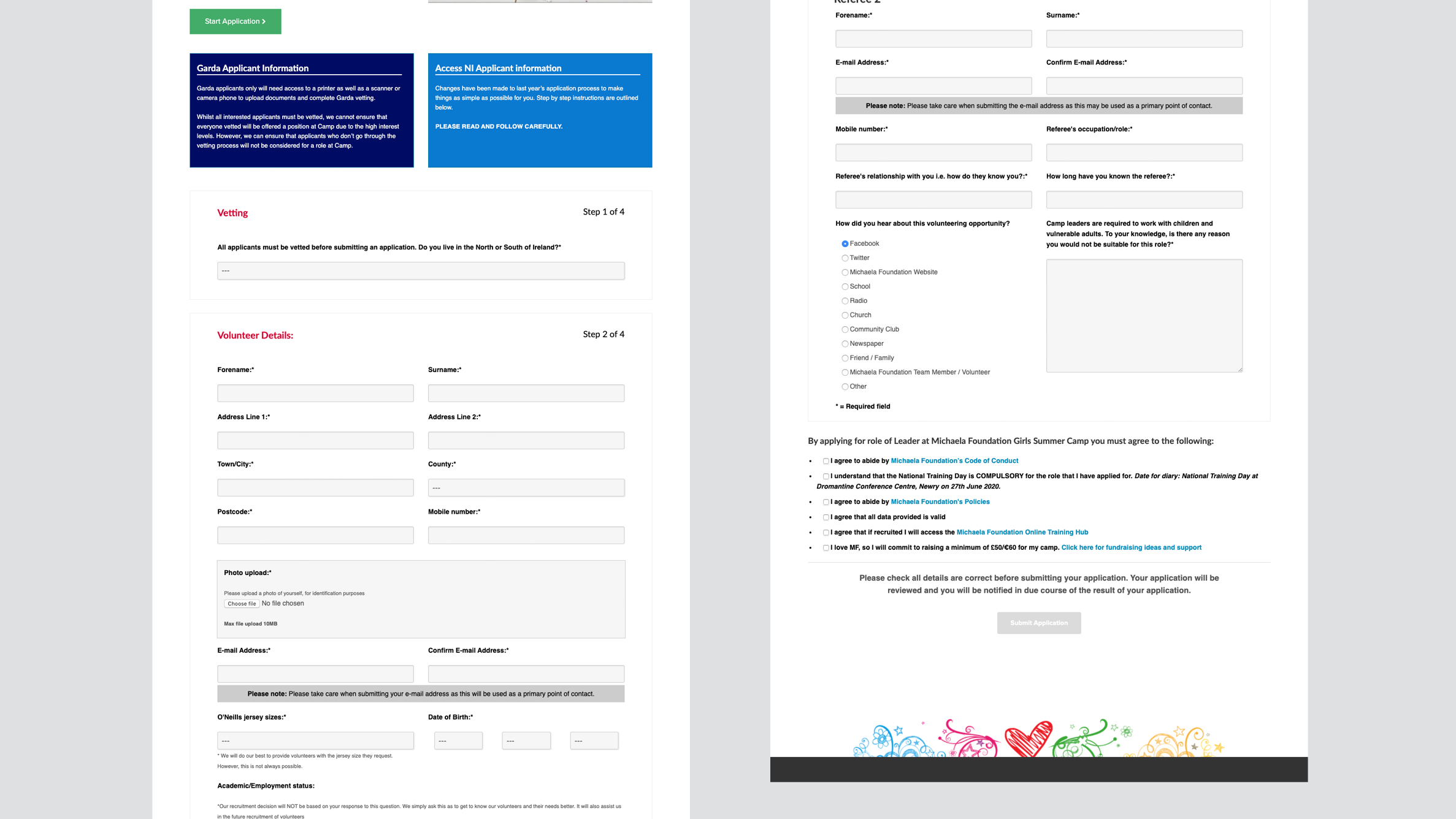
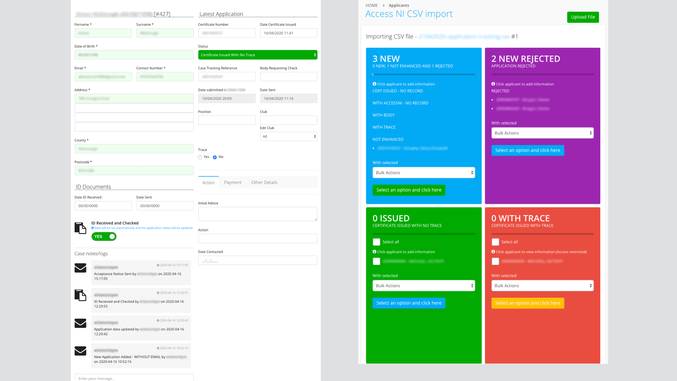
The Foundation has now truly found its place and its vocation. The mission of the Foundation is to promote their core values through every activity they operate. Their summer camps have been an amazing success, sometimes pushing our developers to the limit as camps are booked in seconds!

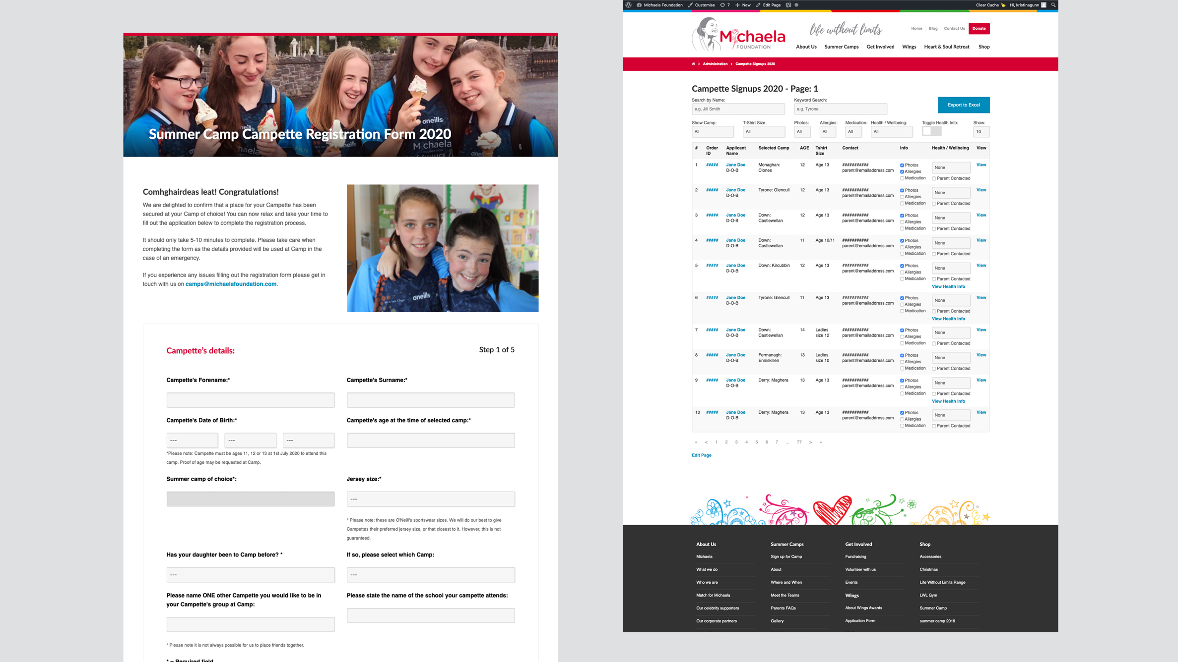

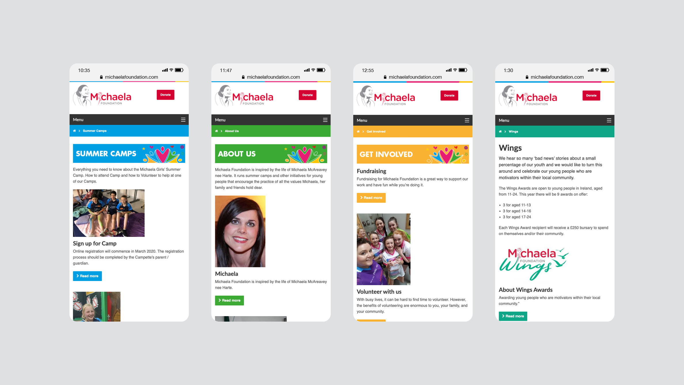

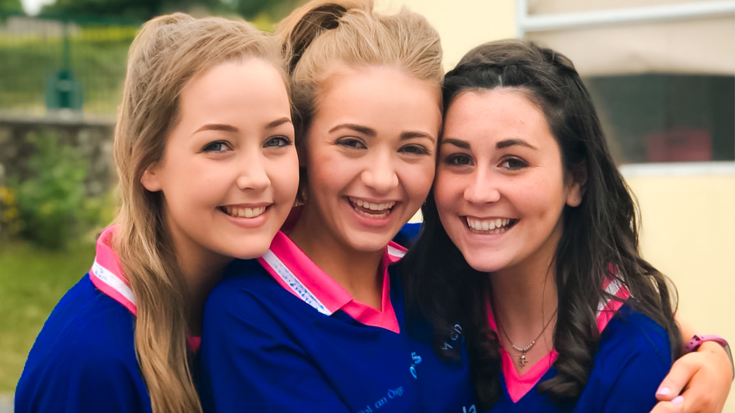
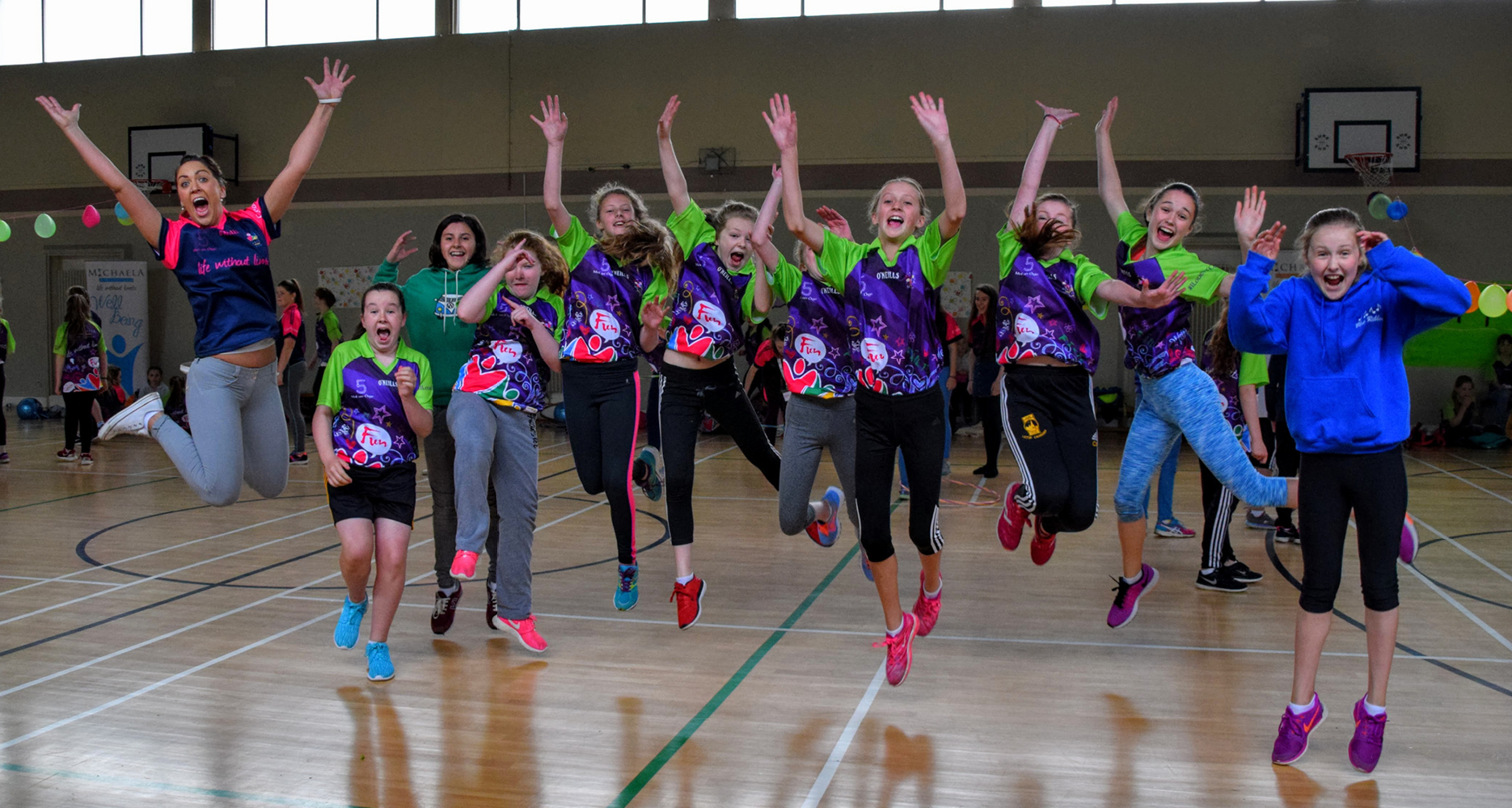
John McAreavey and our designers came to the same conclusion at the same time, that the identity wasn’t reflecting what the foundation had become. Recognising when to hit the reset button is important. As we’re always quoting to clients, it’s not where you are today but where you’re going that matters. At those early meetings we couldn’t see or even plan for where the Foundation was going. We couldn’t see camps filled with colour, laughter and joy.



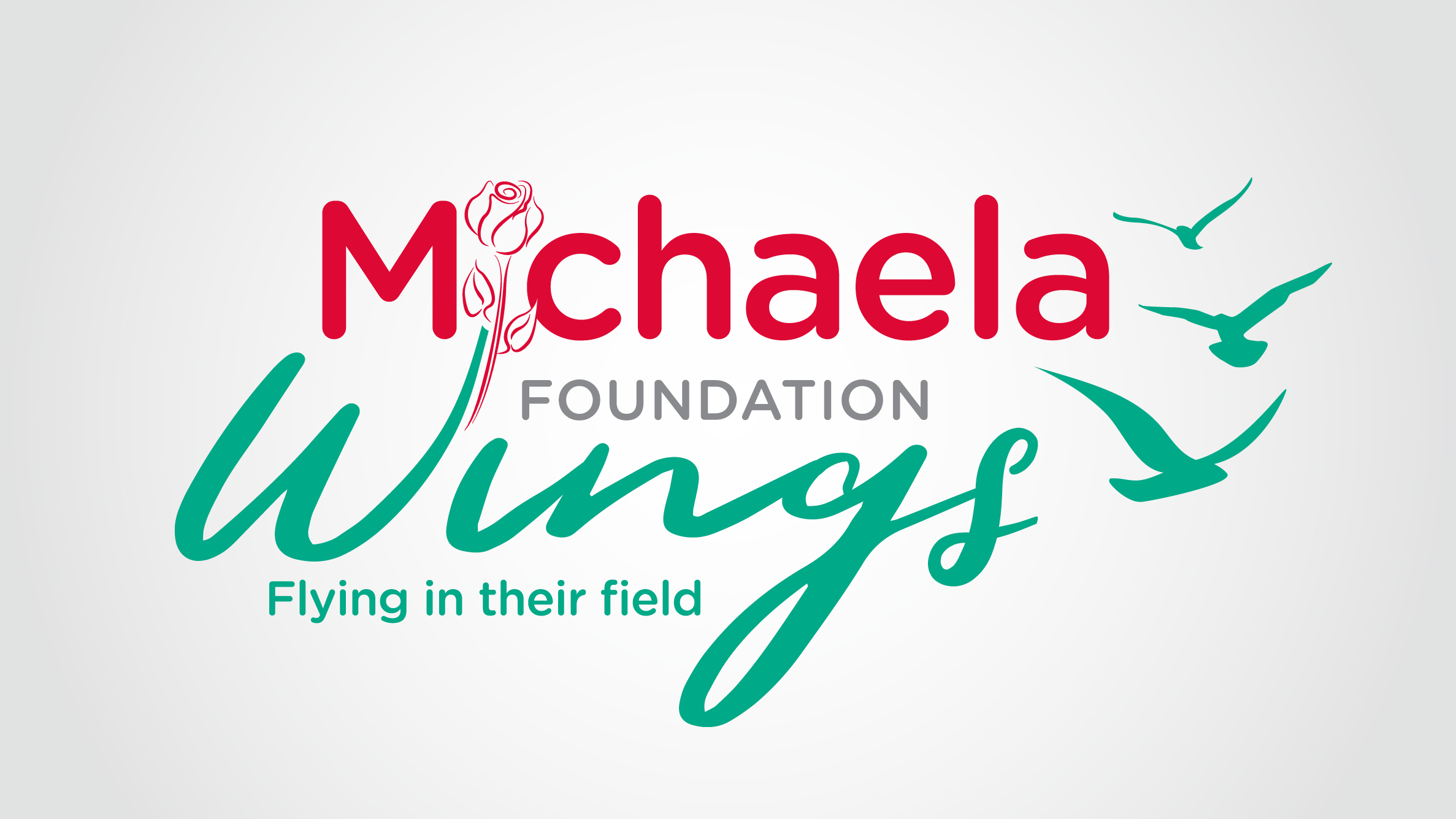
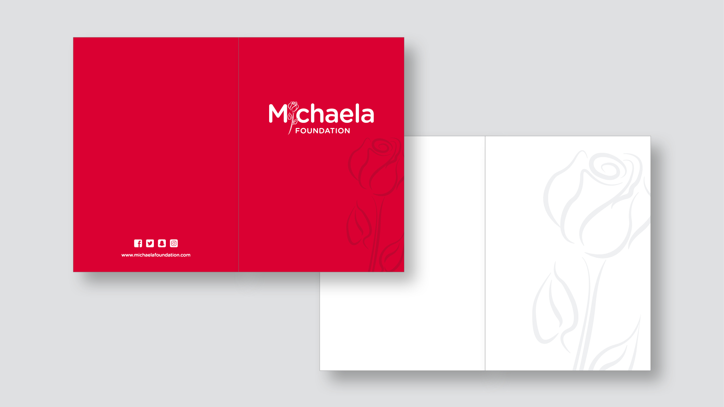
The new identity holds on to some of the existing elements – the silhouette and the rose. It’s simple in execution to reflect the simple mission and ethos of Michaela and the Foundation: ‘We want every young person to feel loved and to see how beautiful they truly are.’
